Dutch performance at Olympic speed skating
9 February 2022
The 2022 Winter Olympics started last week. I’m don’t usually follow sports (of any kind) religiously during a regular year, but I make an exception for the Winter Olympics. In particular the speed skating events I’ll watch live as much as time allows me. It’s no secret the Netherlands is a speed skating nation (although some international TV commentators don’t quite grasp why). Is it fun to watch a sport where you have a high chance of winning? Yes, of course! Is it still exiting? Yes, absolutely! Being the favorites brings a certain pressure that is thrilling. Dutch qualifying games to determine which athletes get to go to the Olympics are always very competitive too, so it’s exiting to see if they can deal with the pressure and which international surprises might threaten their “favorites” status. Watching speed skating events definitely gets my heart pumping faster.
Now, since the last Winter Olympic Games in 2018 I’ve learned quite a bit about data science and data visualization too. So, as I’ve done before on my website, I’ll combine a personal passion with my interest in data analytics and data visualization. In this post I’ll collect some data from an online source, parse and wrangle it, and then create some illustrations. As the code can be quite long, I’ve hidden the code blocks by default to make the text a bit more legible. If you want to see the code, simply click the Show code button and it will appear. Now, let’s see how Dutch performance at the Winter Olympic Games compares and if the “Dutch dominance” is just good marketing or whether there is some truth to it.
First we’ll load the packages, as usual, we’ll use the {tidyverse} package. For some more functionality around text rendering in the plots, we’ll also load the {ggtext} package, and in order to use different fonts than the default ones we’ll use functionality from the {showtext} package and then load a nice sans-serif font called Yanone Kaffeesatz. We’ll incidentally use some other packages, but then we can use the :: operator.
Show code
library(tidyverse)
library(ggtext)
library(showtext)

font_add_google(name = "Yanone Kaffeesatz", family = "custom")
showtext_auto()
Before we can do anything, we need to find a nice dataset. What was quite surprising to me, it was rather tough to find a good dataset on Olympic events and results. Wikipedia of course has all the data one could want, but it’s not always structured in an organized way, which makes it hard to scrape programatically. I looked at the IOC, ISU (International Skating Union), and news agencies, but the best (i.e. most complete and most organized) resource I could was a website called Olympian Database. The website looks rather outdated and the HTML is fairly outdated too, but we can work with this. The website has a main page for speed skating, and then we can iteratively go through the games and events to scrape every individual webpage.
Before we’ve used the {rvest} package to scrape websites, but since then I’ve actually gotten really fond of using Python for web scraping with the Selenium library, and then parsing the HTML with the BeautifulSoup library. So what we’ll do first is scrape and parse the main table. This will give us the links to the speed skating events at each Winter Olympic Game. This will give us a list of all events that were part of that tournament, then we’ll go one level deeper and scrape the table there. This table contains the final placements (and in case of team events, the results from the last rounds), the athlete, country, and a comment (Olympic records, disqualifications, etc.). We’ll run through each game, and each event iteratively, save the data in an individual JSON file, and then at the end merge the individual JSON files into a single large JSON which we can then parse in R. While running this script I found one instance where the header data and some variables were missing, which made machine reading this page very difficult, so when the script got to that instance I filled in the data manually.
Show code
### DOWNLOAD OLYMPIC SPEED SKATING DATA ########################

# -- Libraries -------------------------

from selenium import webdriver
from bs4 import BeautifulSoup
import re
import pandas as pd
import json
import os
import glob

# -- Prologue ------------------------

verbose = True

base_url = "https://www.olympiandatabase.com"
parent_url = f"{base_url}/index.php?id=6934&L=1"

out_path = "./data/event_files"

# -- Get website ------------------------

options = webdriver.ChromeOptions()
options.add_argument("--headless")
driver = webdriver.Chrome(options=options)
driver.get(parent_url)

html_source = driver.page_source
soup = BeautifulSoup(html_source, "html.parser")

# -- Get list of games ------------------------

parent_table = soup.find_all("table", attrs={"class": "frame_space"})[-1]

game_links = []
for link in parent_table.find_all("a"):
    game_links.append(link.get("href"))

game_links = [i for i in game_links if not re.compile(r"http://.*$").match(i)]
game_links = game_links[:-1]

# -- Get list of events per game ------------------------

for i in game_links:
    driver.get(f"{base_url}{i}")
    html_source = driver.page_source
    soup = BeautifulSoup(html_source, "html.parser")

    event_table = soup.find_all("table", attrs={"class": "frame_space"})[-1]

    event_links = []
    for link in event_table.find_all("a"):
        if link.find(text=re.compile("0 m|Combined|Mass|Team")):
            event_links.append(link.get("href"))

    event_links = [
        j for j in event_links if not re.compile(r"/index.php\?id=13738&L=1").match(j)
    ]

    for j in event_links:
        driver.get(f"{base_url}{j}")
        html_source = driver.page_source
        soup = BeautifulSoup(html_source, "html.parser")

        id = re.search("id=(.*)&", j).group(1)
        if id != "11769":
            title = soup.find("h1").text
            year = (
                re.search("Speed Skating (.*) Winter Olympics", title)
                .group(1)
                .split()[-1]
            )
            distance = re.search("'s (.*) -", title).group(1)
            sex = re.search("^(.*)'s", title).group(1).split()[0]
            tab = pd.read_html(f"{base_url}{j}", match="Final")[0]
        else:
            year = "1994"
            distance = "5000 m"
            sex = "Men"
            title = (
                f"{sex}'s {distance} - Speed Skating Lillehammer {year} Winter Olympics"
            )
            tab = pd.read_html(f"{base_url}{j}")[2]

        if verbose:
            print(f"Extracting data for the {sex}'s {distance} from {year}")

        # Write to json
        out_data = {
            "title": title,
            "year": int(year),
            "distance": distance,
            "sex": sex,
            "table": tab.to_json(),
            "id": int(id),
        }

        file_name = f'{year}_{distance.lower().replace(" ", "")}_{sex.lower()}.json'
        with open(f"{out_path}/{file_name}", "w") as file_out:
            json.dump(out_data, file_out, indent=4)

    pass

# -- Quit browser ------------------------

driver.quit()

# -- Merge json files -------------------------

if verbose:
    print("Merging json files")

json_file_list = []
for file in os.listdir(out_path):
    full_path = os.path.join(out_path, file)
    json_file_list.append(full_path)

# -- Define function to merge json files ------------------------

out_name = "./data/all_events.json"

result = []
for f in glob.glob(f"{out_path}/*.json"):
    with open(f, "rb") as infile:
        result.append(json.load(infile))

with open(out_name, "w") as outfile:
    json.dump(result, outfile, indent=4)
I said before that the data is neatly organized, which is true except for a few instances. The individual events are simple tables with a ranking and time for each athlete. It’s a bit more complicated for the team pursuits, since team pursuit events are a direct competition with qualifying rounds and knock-out rounds, the table is a bit more complicated. In this case we’re just interested in the final ranking (so we dismiss the semi- and quarter-finals). The final ranking is split across two columns, so we stitch those together. For some reason the men’s team pursuit from 2018 lists only the medal winners, and not in the same format as the other team pursuit events. One advantage here is that they list individual skaters too, but since this is the only time indivdual skaters are listed among the team pursuits it’s still not very useful. It just meant we have to create another few lines in the if else statement to parse the JSON. In the HTML, the podium places aren’t denoted with a numeric list, but rather with a gold, silver, and bronze badge. Since the Python script doesn’t parse those, we add those back here (except for the 1928 Men’s 10.000 m event, which was canceled due to bad weather).
Show code
parse_json <- function(json) {
  t_df <- jsonlite::fromJSON(json) |>
    as_tibble() |>
    unnest() |>
    janitor::clean_names() %>%
    slice(seq(3, nrow(.) - 2))

  if (str_detect(json, "Men's Team pursuit 2018")) {
    t_df_out <- t_df |>
      filter(is.na(x0)) |>
      rename(
        ranking = x0,
        athlete = x1,
        country = x3,
        time = x4,
        comment = x5
      ) |>
      mutate(
        ranking = rep(seq(3), each = 4),
        ranking = str_glue("{ranking}.")
      ) |>
      fill(country, time, comment) |>
      group_by(ranking) |>
      mutate(athlete = toString(athlete)) |>
      ungroup() |>
      distinct() |>
      select(-x2)
  } else if (str_detect(json, "Men's Team pursuit|Women's Team pursuit")) {
    t_df_tp <- t_df |>
      rename(
        ranking = x0,
        country = x1,
        time = x3,
        comment = x4,
        ranking2 = x5,
        country2 = x6,
        time2 = x8,
        comment2 = x9
      ) |>
      select(
        seq(10),
        -c(x2, x7)
      ) |>
      slice(seq(0, min(which(nchar(ranking) > 3)) - 1))

    t_df_out <- bind_rows(
      t_df_tp |>
        select(seq(4)),
      t_df_tp |>
        select(seq(5, last_col())) |>
        rename_with(~ c("ranking", "country", "time", "comment"))
    )
  } else {
    t_df <- t_df |>
      rename(
        ranking = x0,
        athlete = x1,
        country = x3,
        time = x4,
        comment = x5
      ) |>
      select(-x2)

    if (str_detect(json, "Men's 10000 m 1928", negate = TRUE)) {
      t_df[seq(3), "ranking"] <- str_glue("{seq(3)}.")
    }

    t_df_out <- t_df
  }

  return(t_df_out)
}
Okay, now that we have the function to parse the JSON file, let’s look at some R code. We’ll load the JSON file using the {jsonlite} package, and then parse each JSON string using the map() function from {purrr}.
Then when this data is parsed, we’ll wrangle the nested data frames into one long data frame, and then we’ll tidy up the data. Tied places are denoted using a single dash, we want to get rid of that. Then we’ll fill the missing place numbers using the fill() function. However, there were also a number of people who either did not finish or start or were disqualified and so they don’t have a ranking. These instances are denoted in the time column with a “dnf”, “dns”, or “dq”. Since those are the only times it uses the lowercase d, we can use this feature to replace the ranking with a missing value. We’ll then also add the comment from the time column to the comment column. Then there are also some artifacts which we can easily remove since the country column uses IOC 3-letter abbreviations, so any entry there that’s longer than 3 characters we can remove.
Then we’ll also create two vectors that contain the breaks we’ll use later for the visualizations. Until 1992 both summer and winter olympic games were held in the same year. However, since 1994 they moved the Olympic Winter Games up 2 years to get the alternating schedule we have today. The Olympic Games were also not held during World War II, I want to account for that so I create a vector with each unique entry in the year column. I also want a neatly organized ordering of the events, so I create a vector called event_lims that saves stores this preferred ordering.
Show code
data_load <- jsonlite::fromJSON("./data/all_events.json") |>
  mutate(df = map(table, ~ parse_json(.x)))

data <- data_load |>
  select(-table) |>
  unnest(df) |>
  group_by(year, distance, sex) |>
  mutate(ranking = ifelse(str_detect(ranking, "-"), NA, ranking)) |>
  fill(ranking) |>
  ungroup() |>
  mutate(
    ranking = parse_number(ranking),
    ranking = ifelse(str_detect(time, "d"), NA, ranking),
    comment = ifelse(str_detect(time, "d"), time, comment),
    time = parse_number(time)
  ) |>
  filter(nchar(country) < 4) |>
  arrange(year) |>
  glimpse()
Rows: 5,712
Columns: 10
$ title    <chr> "Men's 1500 m - Speed Skating Chamonix 1924 Winter Olympics",…
$ year     <int> 1924, 1924, 1924, 1924, 1924, 1924, 1924, 1924, 1924, 1924, 1…
$ distance <chr> "1500 m", "1500 m", "1500 m", "1500 m", "1500 m", "1500 m", "…
$ sex      <chr> "Men", "Men", "Men", "Men", "Men", "Men", "Men", "Men", "Men"…
$ id       <int> 12250, 12250, 12250, 12250, 12250, 12250, 12250, 12250, 12250…
$ ranking  <dbl> 1, 2, 3, 4, 5, 6, 7, 8, 8, 10, 11, 12, 13, 14, 15, 16, 17, 18…
$ athlete  <chr> "Clas Thunberg", "Roald Larsen", "Sigurd Moen", "Julius Skutn…
$ country  <chr> "FIN", "NOR", "NOR", "FIN", "NOR", "NOR", "USA", "USA", "USA"…
$ time     <dbl> 2.208, 2.220, 2.256, 2.266, 2.290, 2.292, 2.298, 2.316, 2.316…
$ comment  <chr> "OR", NA, NA, NA, NA, NA, NA, NA, NA, NA, NA, NA, NA, NA, NA,…
Show code
game_years <- unique(data$year)

event_lims <- c("500 m", "1000 m", "1500 m", "3000 m", "5000 m", "10000 m", "Combined", "Team pursuit", "Mass Start")
Then we can finally create some plots. Not all speed skating events were present from the start in 1924. Back then only men competed in Olympic speed skating, the women’s program started in 1960. Here we’ll create something that looks a bit like a Gantt chart. We’ll use a geom_segment() to visualize the timeline and since there’s a few events which have only been on the program once we’ll use a geom_point() for those since geom_segment() requires a begin and end point that are different. Since this is just a casual visualization for illustrative purposes we can take some creative liberty and experiment a bit with the design. That’s why I chose to remove the grid lines and axes, make the lines fairly big and added the individual distances as a label on top of the lines. I also made the text quite large and moved the labels slightly up. The first year an event was held is shown slightly below the line.
Show code
data |>
  select(year, distance, sex) |>
  distinct() |>
  mutate(distance = fct_relevel(distance, ~event_lims)) |>
  group_by(distance, sex) |>
  arrange(year) |>
  summarise(
    first_year = min(year),
    last_year = max(year)
  ) |>
  ggplot(aes(x = first_year, y = distance)) +
  geom_segment(
    aes(
      xend = last_year, yend = distance,
      color = distance
    ),
    linewidth = 8, lineend = "round", alpha = 0.4
  ) +
  geom_point(
    data = . %>% filter(first_year == last_year),
    aes(color = distance),
    size = 8, alpha = 0.5
  ) +
  geom_text(aes(x = first_year, label = first_year),
    color = "#333333", size = 3,
    family = "custom", nudge_y = -0.25
  ) +
  geom_text(aes(x = 2018, label = distance),
    size = 10, color = "grey30", fontface = "bold",
    family = "custom", hjust = 1, nudge_y = 0.2
  ) +
  scale_y_discrete(limits = rev(event_lims)) +
  scico::scale_color_scico_d(guide = "none") +
  facet_wrap(~sex,
    scales = "free_y",
    strip.position = "top"
  ) +
  theme_void(base_family = "custom") +
  theme(
    text = element_text(color = "#333333"),
    strip.text = element_text(face = "bold", size = 42)
  )
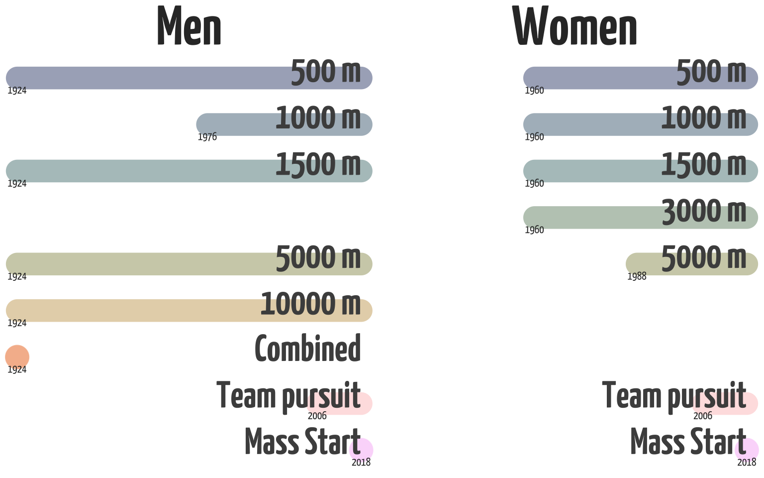
As we can see, the first Winter Olympic Games had only 5 events. This also included an event called “combined”, which is the ranking for the all-round best score at the speed skating tournament. This event was only part of the Olympics in 1924 and an all-round medal hasn’t been awarded since that tournament in 1924. The women’s competition at the Olympics started in 1960 with 4 distances. Today the only difference is that the men have a 10.000 m event, and the women have a 3000 m event. Both competitions have a team pursuit event, but the men skate 8 laps around the 400 m track, while women do 6 laps. Why? I don’t know. I think there’s quite a lot of female athletes who’d love to show how fast they can skate a 10k, and there’s a lot of male athletes who’d love the chance to earn a medal at the medium-distance 3000 m. The mass start is a new event that was added only in 2018, it is a spectacular event that mimics some of the scenarios from the eventful short-track tournament.
Now, let’s dive into the medals. First let’s create a simple barplot with the total number of medals. As I prefer, we’ll rotate so that the bars extent across the x-axis instead of the y-axis. This leaves more space for the country names (which we’ll extract from the IOC codes using the {countrycodes} package) so we don’t have to rotate labels. A simple rule: never rotate labels if you can avoid it. It makes the labels harder to read and increases cognitive load. To make the plot a bit cleaner, we’ll move the title and subtitle (which we’ll create with {ggtext}’s geom_richtext()) to the empty space in the barplot. Since I want to draw attention to the Netherlands in particular, I’ll highlight that bar in its national orange color. We can easily do that by creating a separate column which will store the hex-value of the color and then we can use scale_fill_identity() to make the bar the color saved in that column.
Show code
data |>
  filter(
    year >= 1960,
    ranking %in% seq(3)
  ) |>
  mutate(
    country_long = countrycode::countrycode(
      country,
      origin = "ioc",
      destination = "country.name"
    ),
    country_long = case_when(
      str_detect(country, "URS") ~ "Soviet Union",
      str_detect(country, "GDR") ~ "East Germany",
      str_detect(country, "FRG") ~ "West Germany",
      str_detect(country, "OAR") ~ "Olympic Athletes from Russia",
      TRUE ~ country_long
    ),
    country_label = str_glue("{country_long} ({country})")
  ) |>
  count(country_label, sort = TRUE) |>
  mutate(highlight_col = ifelse(
    str_detect(country_label, "NED"), "#FF9B00", "grey"
  )) |>
  ggplot(aes(x = n, y = reorder(country_label, n))) +
  geom_col(aes(fill = highlight_col)) +
  geom_vline(xintercept = 0, linewidth = 1) +
  geom_richtext(
    data = tibble(), aes(
      x = 24, y = 15,
      label = "Total number of medals won per country since 1960"
    ),
    family = "custom", size = 7, fontface = "bold", hjust = 0,
    label.padding = unit(0.75, "lines"), label.color = NA
  ) +
  geom_richtext(
    data = tibble(), aes(
      x = 24, y = 13,
      label = "The Netherlands has won more than twice as many medals as the runner-up"
    ),
    family = "custom", size = 4, hjust = 0,
    label.padding = unit(0.75, "lines"), label.color = NA
  ) +
  labs(
    x = NULL,
    y = NULL
  ) +
  scale_x_continuous(expand = expansion(add = c(0, 9)), position = "top") +
  scale_fill_identity() +
  theme_minimal(base_family = "custom") +
  theme(panel.grid.major.y = element_blank())
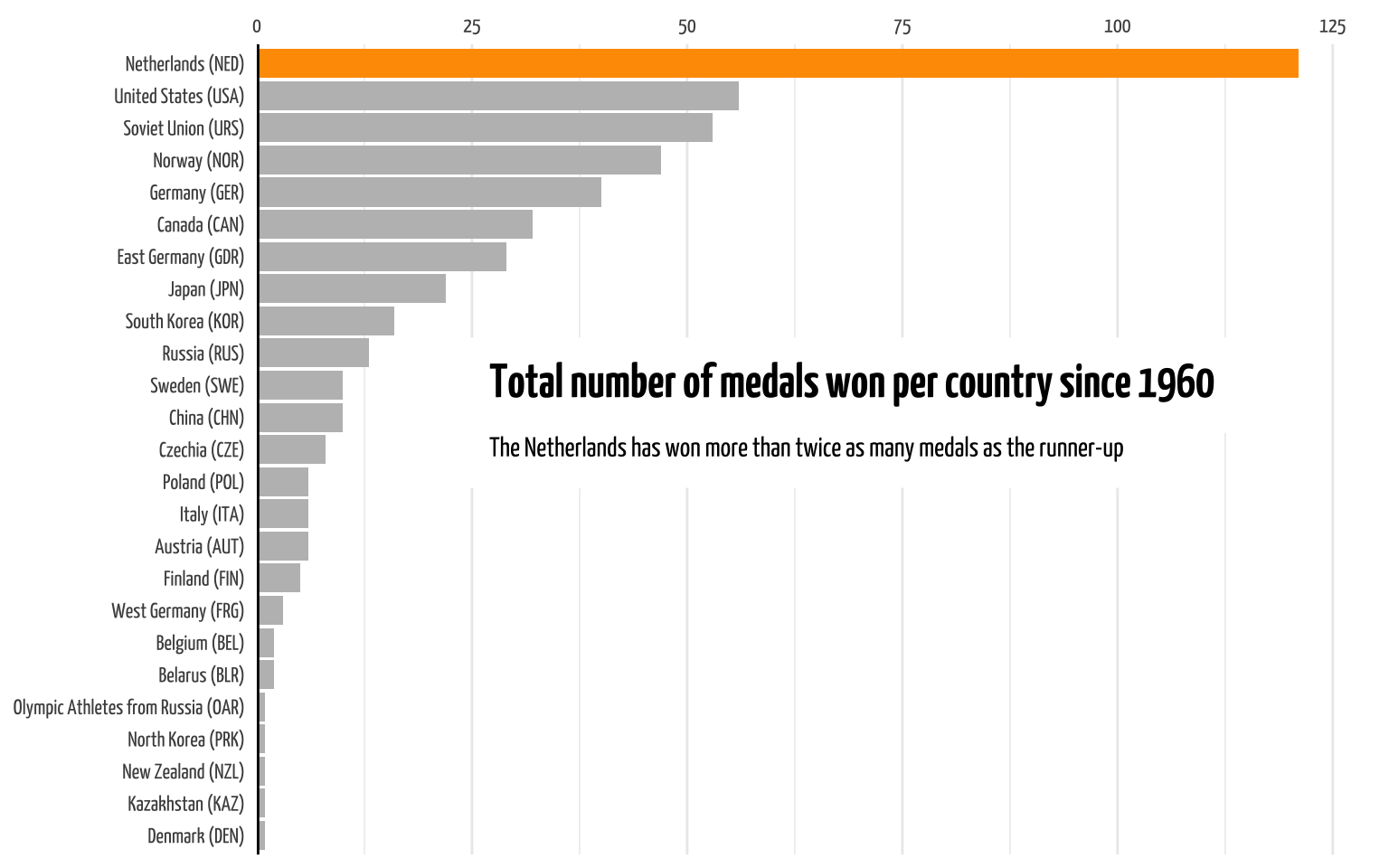
As you can see, the Netherlands has earned by far the most medals since 1960 than any other country. In fact, it’s earned more medals than number two and three combined. Now, news agencies have reported on the total number of medals, and numbers may slightly differ between reports. This is the number reported by the source, unless I made some errors in scraping, parsing, or wrangling the data. Even if, differences of 3 or 4 medals won’t change the message that the Netherlands is absolutely dominant in this area of the Winter Olympics.
Let’s look at how this distribution is spread out across the different Olympic events. We’ll start in 1960 since that’s when the women’s tournament was added and I consider that the proper start of the Winter Olympics. Since 1960 we’ve had 16 Winter Olympics (the 17th is currently underway). Since not all games had the same number of medals (events were added at different years), I’ll calculate the percentage of medals won per year.
Show code
data |>
  filter(
    ranking %in% seq(3),
    year >= 1960
  ) |>
  group_by(year) |>
  mutate(total_medals = n()) |>
  group_by(year, country) |>
  summarise(
    medals_won = n(),
    total_medals = first(total_medals)
  ) |>
  mutate(
    perc_won = medals_won / total_medals,
    perc_label = str_glue("{round(perc_won * 100)}%"),
    highlight_col = ifelse(country == "NED", "#FF9B00", "grey"),
    country = tidytext::reorder_within(country, perc_won, year)
  ) |>
  slice_max(perc_won, n = 5) |>
  ggplot(aes(x = perc_won, y = country)) +
  geom_col(aes(fill = highlight_col)) +
  geom_text(aes(label = perc_label),
    family = "custom",
    size = 2, hjust = 0, nudge_x = 0.01
  ) +
  labs(
    title = "**Most medals won per country per Olympic Game**",
    subtitle = "The Netherlands has won the largest proportion (shared in 1994 and 2002) of speed skating medals **every Game since 1994**",
    x = "Percentage of all medals won",
    y = NULL
  ) +
  tidytext::scale_y_reordered() +
  scale_x_continuous(
    limits = c(0, 0.7),
    labels = scales::label_percent()
  ) +
  scale_fill_identity() +
  facet_wrap(~year, scales = "free_y") +
  theme_minimal(base_family = "custom") +
  theme(
    plot.title = element_markdown(size = 26),
    plot.subtitle = element_markdown(size = 12),
    strip.text = element_text(size = 16, face = "bold"),
    panel.grid.major.y = element_blank()
  )
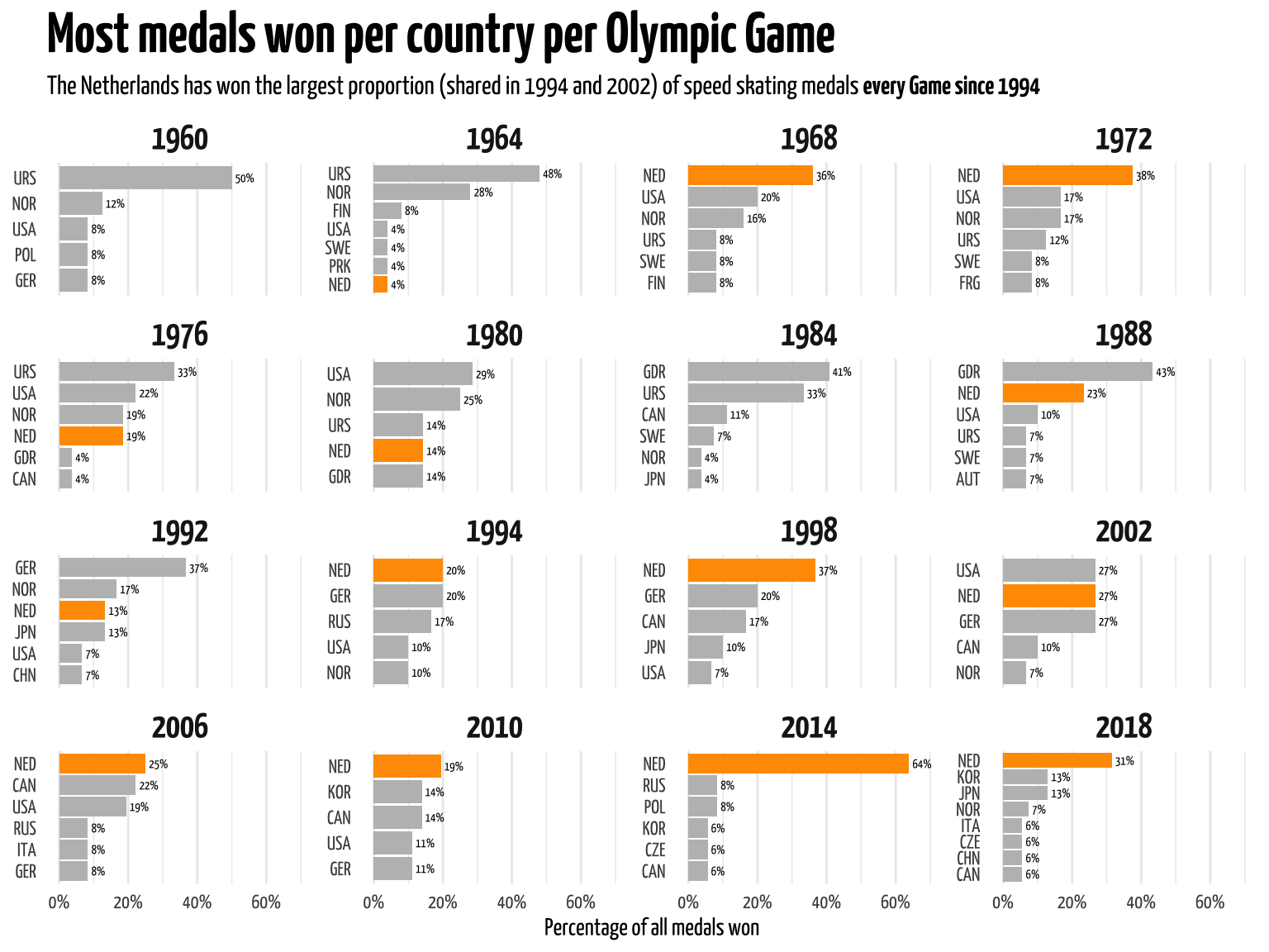
As you can see from the plot, of the 16 Olympic Games since 1960, the Netherlands has earned the largest share of medals 9 times (56.25%). It has topped the list every game since 1994 (shared in 1994 and 2002). In 2014, the Netherlands took home 64% of all medals. Due to ISU and IOC qualification rules it’s technically impossible for a single country to take home all medals (e.g. a country cannot send three teams for the team pursuit). So there might be 36 medals available (from 12 events), but a single country can only take home 32. Since I didn’t want to go into the (sometimes changing) qualification rules since 1960 I made it simple and calculated based on the total number of medals, not the total number available to a country.
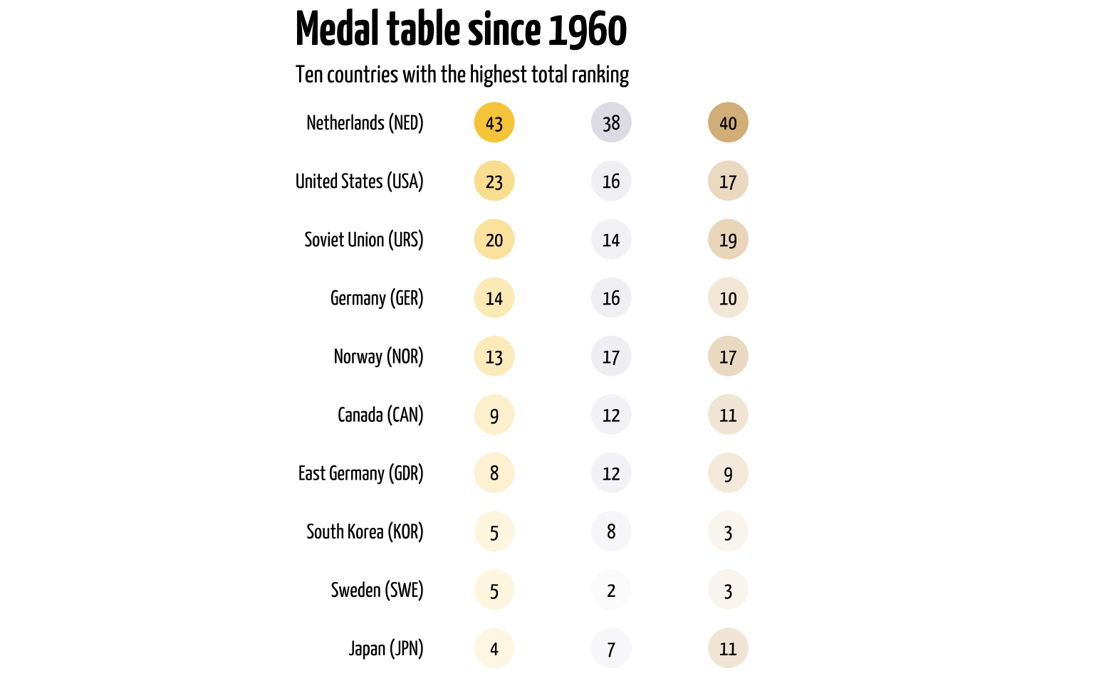
But of course, not all medals are created equal. In Olympic rankings or medal tables, the order is determined by the number of gold medals first, then silver, then bronze. Total number of medals does not matter here. So a country with 2 gold medals and no other metal will be ranked above a country with 1 gold medal, 10 silver, and 15 bronze medals. So the Netherlands can win a lot of medals, but for rankings the color matters too. So let’s create a metal table. Again, we’ll only look at results from 1960. We’ll calculate the number of medals each country won, then we’ll fill in the blank spaces with the amazing complete() function. Since not all medals are equal, we’ll add a multiplier and then calculate a theoretical score (where gold counts 10 times stronger than a silver etc.). Then we’ll look at the top 10 countries and use geom_point() to create a table.
Show code
data |>
  filter(
    year >= 1960,
    ranking %in% seq(3)
  ) |>
  group_by(country, ranking) |>
  summarise(n_medals = n()) |>
  ungroup() |>
  complete(country, ranking) |>
  replace_na(list(n_medals = 0)) |>
  mutate(
    country_long = countrycode::countrycode(
      country,
      origin = "ioc", destination = "country.name"
    ),
    country_long = case_when(
      str_detect(country, "URS") ~ "Soviet Union",
      str_detect(country, "GDR") ~ "East Germany",
      TRUE ~ country_long
    ),
    country_label = str_glue("{country_long} ({country})"),
    ranking_color = case_when(
      ranking == 1 ~ "#F8CC46",
      ranking == 2 ~ "#DFDFE7",
      ranking == 3 ~ "#D8B581"
    ),
    rank_mult = case_when(
      ranking == 1 ~ 100,
      ranking == 2 ~ 10,
      ranking == 3 ~ 1
    ),
    rank_score = n_medals * rank_mult
  ) |>
  group_by(country) |>
  mutate(country_rank = sum(rank_score)) |>
  ungroup() |>
  slice_max(country_rank, n = 30) |>
  ggplot(aes(
    x = ranking, y = reorder(country_label, country_rank),
    fill = ranking_color, alpha = n_medals
  )) +
  geom_point(
    shape = 21, size = 10,
    stroke = 0, show.legend = FALSE
  ) +
  geom_text(aes(label = n_medals), alpha = 1, family = "custom") +
  labs(
    title = "**Medal table since 1960**",
    subtitle = "Ten countries with the highest total ranking",
    x = NULL,
    y = NULL
  ) +
  scale_x_discrete(position = "top") +
  scale_fill_identity() +
  coord_fixed(ratio = 1 / 2) +
  theme_void(base_family = "custom") +
  theme(
    plot.title.position = "plot",
    plot.title = element_markdown(size = 26),
    plot.subtitle = element_markdown(size = 13),
    axis.text.y = element_text(hjust = 1)
  )
To show that a country is dominant in a particular competition it helps to show that a country can deliver not just one, but a few contenders for Olympic gold. The greatest display of strength for a country is to take home all medals in a single event, a so-called podium sweep. If a country can take home gold, silver, and bronze in a single event it may show they’re competing mostly with each other. Now, to calculate this can simply take the rankins, group by event and country, and count how often a single country took home three medals in a single event. For this we’ll create a simple stacked barplot.
Show code
data |>
  filter(
    year >= 1960,
    ranking %in% seq(3)
  ) |>
  group_by(year, distance, sex, country) |>
  count(year, distance, sex, country, name = "medals_won") |>
  filter(medals_won == 3) |>
  mutate(sweeps = medals_won / 3) |>
  ggplot(aes(x = year, y = sweeps, fill = country)) +
  geom_col(key_glyph = "point") +
  geom_hline(yintercept = 0) +
  labs(
    title = "**Podium sweeps since 1960**",
    subtitle = "The Netherlands had 7 out 13 podium sweeps (winning gold, silver, **and** bronze in a single event),<br> including 4 at the 2014 Olympics in Sochi",
    x = NULL,
    y = "Number of podium sweeps",
    fill = NULL
  ) +
  scale_x_continuous(limits = c(1960, NA), breaks = game_years) +
  scale_y_continuous(expand = expansion(mult = c(0, 0.05))) +
  scico::scale_fill_scico_d(
    palette = "batlow",
    guide = guide_legend(override.aes = c(shape = 21, size = 4))
  ) +
  theme_minimal(base_family = "custom") +
  theme(
    plot.title = element_markdown(size = 26),
    legend.text = element_text(size = 10),
    legend.key.height = unit(0.75, "lines"),
    plot.subtitle = element_markdown(size = 13, lineheight = 0.5),
    axis.text.x = element_text(size = 7),
    axis.text.y = element_text(size = 12),
    axis.title.y = element_text(size = 12),
    panel.grid.major.x = element_blank(),
    panel.grid.minor = element_blank()
  )
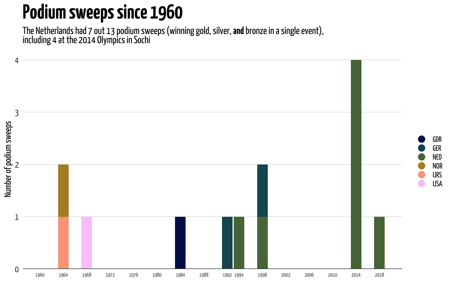
As you might gather, from this and the previous plot, the Winter Olympic Games from 2014 were a very good year for the Dutch speed skating team. That one year the Netherlands had four podium sweeps.
Show code
data |>
  mutate(distance = fct_relevel(distance, ~event_lims)) |>
  filter(
    str_detect(comment, "OR"),
    distance != "Combined"
  ) |>
  group_by(distance, sex) |>
  arrange(year) |>
  mutate(no = row_number()) |>
  ggplot(aes(x = year, y = no, color = distance)) +
  geom_vline(
    xintercept = c(1940, 1944),
    linetype = "dashed", color = "grey92"
  ) +
  geom_step(linewidth = 1.5, alpha = 0.4, show.legend = FALSE) +
  geom_point(size = 4, alpha = 0.75, stroke = 0) +
  ggrepel::geom_text_repel(
    data = . %>% filter(no == max(no)),
    aes(label = country), show.legend = FALSE, seed = 2,
    color = "#333333", size = 4,
    family = "custom", fontface = "bold"
  ) +
  labs(
    title = "**Olympic Records over the years**",
    subtitle = "The Netherlands hold 4/6 olympic records with the men, and 3/6 records with the women.<br>
       Current record holder indicated with the IOC abbreviation",
    x = "Winter Games",
    y = NULL,
    color = NULL
  ) +
  scale_x_continuous(
    breaks = game_years,
    labels = str_replace(game_years, "^19|^20", "'")
  ) +
  scale_y_continuous(breaks = NULL) +
  scico::scale_color_scico_d(
    guide = guide_legend(override.aes = c(size = 4, alpha = 1))
  ) +
  facet_wrap(~sex, nrow = 2, strip.position = "left") +
  theme_minimal(base_family = "custom") +
  theme(
    text = element_text(color = "#333333"),
    legend.position = c(0.2, 0.25),
    legend.key.height = unit(0.75, "lines"),
    plot.title = element_markdown(size = 26),
    plot.subtitle = element_markdown(size = 13),
    strip.text = element_text(size = 24, face = "bold"),
    panel.grid.major.y = element_blank(),
    panel.grid.minor = element_blank()
  )
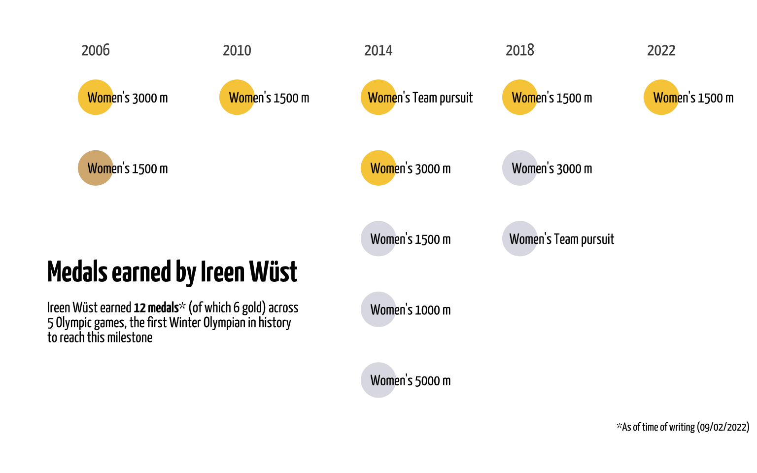
Next, I want to highlight one athlete in particular. The Dutch team is a powerhouse of speed skating, but a team is still made up of individual athletes. And one of those athletes deserves some special attention: Ireen Wüst. She is one of the most successful Winter Olympic athletes ever and the most succesful speed skater of all time. As of time of writing (9/2/2022) she won 6 gold, 5 silver, and 1 bronze medals across 5 Winter Olympic Games. She’s the only Olympian (Winter or Summer) to win individual gold in 5 different Olympic Games. So let’s look at her performance. Let’s extract all events where Ireen Wüst participated. One caveat here is that we can’t only look for her name in the athlete column, and as we saw before, there’s also team pursuit where individual names aren’t registered in the website. Lucky for us, Ireen Wüst participated in all team pursuit events (only held since 2006), so we’ll extract all instances where the Dutch team pursuit team participated. Since the 2022 Olympics are already underway and Ireen has already won a gold medal in her first event, I’ll add a row manually to include this data too.
Show code
data_wust <- data |>
  filter(str_detect(athlete, "Ireen") |
    str_detect(title, "Women's Team pursuit") &
      country == "NED") |>
  add_row(tibble(
    year = 2022,
    distance = "1500 m",
    sex = "Women",
    ranking = 1,
    comment = "OR"
  )) |>
  glimpse()
Rows: 18
Columns: 10
$ title    <chr> "Women's 1000 m - Speed Skating Torino 2006 Winter Olympics",…
$ year     <dbl> 2006, 2006, 2006, 2006, 2010, 2010, 2010, 2010, 2014, 2014, 2…
$ distance <chr> "1000 m", "Team pursuit", "3000 m", "1500 m", "1500 m", "Team…
$ sex      <chr> "Women", "Women", "Women", "Women", "Women", "Women", "Women"…
$ id       <int> 8524, 8532, 8528, 8526, 14151, 14139, 14155, 14147, 21092, 21…
$ ranking  <dbl> 4, 6, 1, 3, 1, 6, 8, 7, 2, 1, 2, 1, 2, 2, 9, 1, 2, 1
$ athlete  <chr> "Ireen Wust", NA, "Ireen Wust", "Ireen Wust", "Ireen Wust", N…
$ country  <chr> "NED", "NED", "NED", "NED", "NED", "NED", "NED", "NED", "NED"…
$ time     <dbl> 1.1639, 3.0562, 4.0243, 1.5690, 1.5689, 3.0204, 1.1728, 4.080…
$ comment  <chr> NA, NA, NA, NA, NA, NA, NA, NA, NA, "OR", NA, NA, NA, NA, NA,…
So Ireen participated in 18 events across 5 Olympic Games. She participated in all events apart from the 500 m and the 5000 m. Now, let’s see how often she’ll take home a medal if she shows up at the start. For this we can calculate a win rate. Let’s count per year how many medals she won, and then we can calculate a percentage and create a barplot.
Show code
data_wust |>
  group_by(year, medals_won = ranking %in% seq(3)) |>
  mutate(medals_won = ifelse(medals_won, "medals_won", "medals_not_won")) |>
  count() |>
  ungroup() |>
  complete(year, medals_won, fill = list(n = 0)) |>
  pivot_wider(names_from = medals_won, values_from = n) |>
  mutate(
    total_events = medals_won + medals_not_won,
    perc_won = medals_won / total_events,
    perc_won_label = str_glue("{round(perc_won * 100,1)}%"),
    perc_won_label = ifelse(
      year == 2022, str_glue("{perc_won_label}*"), perc_won_label
    ),
    year = as_factor(year),
    year = fct_rev(year)
  ) |>
  ggplot(aes(x = perc_won, y = year)) +
  geom_segment(aes(x = 0, xend = perc_won, yend = year),
    linewidth = 10, lineend = "round", color = "#FF9B00"
  ) +
  geom_text(aes(label = perc_won_label),
    size = 4,
    family = "custom", hjust = 1
  ) +
  labs(
    title = "**Will Ireen win a medal if she shows up?**",
    subtitle = "Of all the events Ireen Wüst participated in, how often did she win a medal (of any color)?<br>2022 Olympics is still ongoing, shown is win rate **so far***",
    caption = "*As of time of writing (09/02/2022)",
    x = NULL,
    y = NULL
  ) +
  scale_x_continuous(
    breaks = NULL,
    expand = expansion(add = c(0, 0.05))
  ) +
  coord_fixed(1 / 12) +
  theme_minimal(base_family = "custom") +
  theme(
    plot.title.position = "plot",
    plot.title = element_markdown(size = 26),
    plot.subtitle = element_markdown(size = 13),
    axis.text.y = element_markdown(size = 13),
    panel.grid.major.y = element_blank()
  )
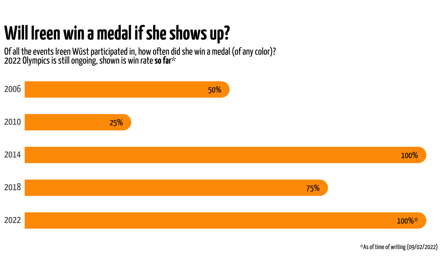
With the caveat that Ireen has only participated in one event in 2022 (as of time of writing, 9/2/2022), there has been one instance where she took home a medal on every single event she participated in. The Sochi Olympics in 2014 were successful for the Dutch team and for Ireen Wüst individually too.
Finally, we can also visualize the individual medals she won. Again, I’ll take some artistic liberty here by creating a sort-of bar plot, but instead with geom_point()’s in the shape and color of the medals.
Show code
data_wust |>
  filter(ranking %in% seq(3)) |>
  mutate(
    ranking_color = case_when(
      ranking == 1 ~ "#F8CC46",
      ranking == 2 ~ "#DFDFE7",
      ranking == 3 ~ "#D8B581"
    ),
    label = str_glue("{sex}'s {distance}")
  ) |>
  group_by(year) |>
  arrange(ranking) |>
  mutate(y = row_number()) |>
  ggplot(aes(x = year, y = -y)) +
  geom_point(aes(color = ranking_color), size = 12) +
  geom_text(aes(label = label),
    size = 4,
    family = "custom", hjust = 0.1
  ) +
  geom_richtext(
    data = tibble(), aes(
      x = 2004.5, y = -3.5,
      label = "**Medals earned by Ireen Wüst**"
    ),
    family = "custom", size = 8, hjust = 0, label.color = NA
  ) +
  geom_richtext(
    data = tibble(), aes(
      x = 2004.5, y = -4.2,
      label = "Ireen Wüst earned **12 medals*** (of which 6 gold) across<br>5 Olympic games, the first Winter Olympian in history<br>to reach this milestone"
    ),
    family = "custom", size = 4, hjust = 0, label.color = NA,
    lineheight = 1
  ) +
  labs(
    x = NULL,
    y = NULL,
    caption = "*As of time of writing (09/02/2022)"
  ) +
  scale_x_continuous(
    breaks = c(game_years, 2022), position = "top",
    expand = expansion(add = c(1, 2.5))
  ) +
  scale_y_continuous(
    breaks = FALSE,
    expand = expansion(add = c(0.5, 0.5))
  ) +
  scale_color_identity() +
  coord_fixed(ratio = 2) +
  theme_minimal(base_family = "custom") +
  theme(
    plot.title = element_markdown(size = 26),
    plot.subtitle = element_markdown(size = 13),
    axis.text.x = element_markdown(size = 13),
    panel.grid = element_blank()
  )
Of course the Olympics are still ongoing, but I had a lot of fun collecting and visualizing this data. Again, not all numbers might correspond to official IOC records (as detailed here), and I’ll welcome any feedback on the code in this post. I’ll use these posts as a creative outlet for data visualization ideas that my current professional work doesn’t allow for. Since this is my own website and these posts aren’t always very serious, I have some creative liberty. I enjoy writing these posts and they get the creative juices flowing. I hope for those not interested in speed skating they at least found the data wrangling process and visualization useful. I enjoy reading other people’s blogposts since I usually learn a new function or approach, so I hope I can do the same for others. The Winter Olympics happen every four years so I won’t get much opportunity to do this again any time soon, but it might update this post later with the latest data.