Everything is a Linear Model
18 March 2022
Let’s imagine you’re incredibly lazy and you want to learn R, but you only want to learn one function to do statistics. What function do you learn? I’d recommend to learn to use the lm() function. Why? Because most common statistical tests are in fact nothing more than some variation of a linear model, from the simplest One-Sample T-test to a repeated-measures ANOVA. I think most people that have Googled for this question have found Jonas Lindeløv’s post on how common statistical tests are linear models (as they should, it’s an amazing post). Here I want to go a bit more in depth into the mathematics behind this statement to show how common statistical tests are in fact variations of a linear model.
Don’t believe me? Fine, I’ll show you.
Let’s load the packages we’ll use today and set a seed so it’s reproducible.
library(tidyverse)
library(patchwork)

set.seed(2022)
One-Sample T-test
Let’s start simple with the One-Sample T-test. This test can be used to test how the mean value of your sample measure differs from a reference number. Throughout this post, I’ll throw around a bunch of formulas, which, depending on your background, can either be informative or confusing. The formula for a One-Sample T-test is:
$$ t = \frac{\overline{x} - \mu}{\frac{\sigma}{\sqrt{n}}} = \frac{sample~mean - population~mean}{\frac{standard~deviation}{\sqrt{sample~size}}} $$
What this says is that the effect size ($t$) is equal to the sample mean minus the population mean (or reference number) and you divide it by the standard deviation of the sample divided by the square root of the sample size. This formula will output the $t$-value that you would usually report when doing a T-test. The formula requires the standard deviation (σ) of the sample values, which is:
$$ \sigma = \sqrt{\frac{\sum\limits_{i=1}^n{(x_{i} - \overline{x})^2}}{n - 1}} $$
In this formula, you’d subtract the average across the sample values from each individual value, square it, and sum all these resulting values. This sum you would then divide by the size of the sample minus one (or the degrees of freedom), and take the square root of the whole thing. This will give the standard deviation (σ). Alright, let’s now consider a study where we collected blood samples from a number of patients and measured for instance sodium levels in the blood. We don’t have a control group for this study, but we know from medical textbooks that the reference value for sodium in healthy individuals for the age and sex distribution in our sample is for instance 2.5 mmol/L. Then we measure the sodium levels for 30 patients, we can simulate some fake measurements by generating a random sequence of values with a mean of 3 and a standard deviation of 1.2.
rnorm() but this is just for illustrative purposesref_concentration <- 2.5
n <- 30
concentration <- rnorm(n, mean = 3, sd = 1.25)
If we then implement these values in the formulas earlier, we get the following result for the standard deviation:
$$ \sigma = \sqrt{\frac{\sum\limits_{i=1}^n{|x_{i} - \overline{x}|^2}}{n - 1}} = \sqrt{\frac{\sum\limits_{i=1}^{30}{|concentration_{i} - 2.855|^2}}{30 - 1}} = 1.157 $$
this formula would like like this when implemented in R:
sqrt(sum(abs(concentration - mean(concentration))^2) / (n - 1))
[1] 1.157324
But of course in any normal setting, you’d use the sd() function, which will give the same result as the code above, but I just wanted to show it for illustrative purposes. Anywhere else I’ll use the sd() function. Now let’s calculate the $t$-value. In formula form this would look like this:
$$ t = \frac{\overline{x} - \mu}{\frac{\sigma}{\sqrt{n}}} = \frac{2.855 - 2.5}{\frac{1.157}{\sqrt{30}}} = 1.681 $$
So just to over this formula again, you take the mean of your sample, subtract the reference number, and you divide this number by the standard deviation of your sample divided by the square root of the sample size. Or in R-terms:
(mean(concentration) - ref_concentration) / (sd(concentration) / sqrt(n))
[1] 1.680503
Now we can compare this to the t.test() function and then we’d find the same $t$-value (barring some rounding and digit cutoffs). In this function, since we’re not comparing two samples, we set the population mean (mu) we want to compare to as the reference concentration (the default value for a One-Sample T-test is 0). What the mu option does is nothing else than subtract the reference value from all values. By doing this it centers all the values relative to 0, so if we’d run t.test(concentration - ref_concentration), we’d get the same result, obviously with a different mean and the values of the confidence interval have changed, although the range stays the same.
t.test(concentration, mu = ref_concentration)
    One Sample t-test

data:  concentration
t = 1.6805, df = 29, p-value = 0.1036
alternative hypothesis: true mean is not equal to 2.5
95 percent confidence interval:
 2.422934 3.287238
sample estimates:
mean of x
 2.855086
t.test(concentration - ref_concentration, mu = 0)
    One Sample t-test

data:  concentration - ref_concentration
t = 1.6805, df = 29, p-value = 0.1036
alternative hypothesis: true mean is not equal to 0
95 percent confidence interval:
 -0.07706581  0.78723830
sample estimates:
mean of x
0.3550862
So now back to the premise of this exercise, how is a T-test the same as a linear model? Like we showed before, subtracting the reference value from the sample values and adding that to a T-test comparing the values to 0 is equivalent to comparing the sample values to the reference value. Now let’s consider what a linear model does. You might recall from high-school mathematics that the formula for a straight line is always some form of $y = ax + c$, the linear model formula is somewhat similar:
$$ Y_i = \beta_{0} + \beta_{1}x + \epsilon_{i} $$
In this formula $Y_i$ is the dependent variable, $x$ is the independent variable. $\beta_0$ is equivalent to the intercept at the y-axis, similar to $c$ in the formula for a straight line. $\beta_1$ is the slope. Finally, the $\epsilon_i$ is the random error term.
Now let’s build the linear model. Remember that the formula for the linear model included this term: $\beta_{1}x$. In this case, since we only have one sample, we don’t have any value to multiply our value to, so we multiply it by 1. If we wanted to correlate two variables, for instance concentration with age, we would substitute the 1 with a continuous variable, i.e. age, but in this case we correlate all sample values with 1. Since we still want to compare our value to 0, we subtract the reference value from our sample values like we did before for the t.test(). Let’s build the linear model.
ost_model <- lm((concentration - ref_concentration) ~ 1)
summary(ost_model)
Call:
lm(formula = (concentration - ref_concentration) ~ 1)

Residuals:
    Min      1Q  Median      3Q     Max
-3.4809 -0.8653  0.0617  0.8742  1.6593

Coefficients:
            Estimate Std. Error t value Pr(>|t|)
(Intercept)   0.3551     0.2113   1.681    0.104

Residual standard error: 1.157 on 29 degrees of freedom
Again, we find the same $t$- and $p$-value as when we ran the t.test()! How exciting is that! We now have three ways to obtain the same values. Later I’ll go into what the Residuals, Estimate and Std. Error mean when running comparing group means with a linear model.
Two-Sample T-test
Now we’ll apply the same logic we used for the One-Sample T-test to show how an Two-Sample T-test is in essence a linear model. First we’ll look at the formula again, then the implementation using the t.test() function, and then the linear model. Let’s now consider another experiment using the blood measurements we had before, but now we actually do have a control sample. We have 30 participants in both samples. Let’s generate some random data:
n <- 30
data <- tibble(
  concentration = c(
    rnorm(n, mean = 4, sd = 1.5),
    rnorm(n, mean = 6, sd = 2)
  ),
  group = rep(c("HC", "PAT"), each = n)
)
The formula for an Two-Sample T-test is very similar to that of the One-Sample T-test, with the added factor of the second set of sample values. The formula for an Two-Sample T-test is as follows:
$$ t = \frac{(\overline{x_1} - \overline{x_2})}{\sqrt{\frac{\sigma_1^2}{n_1} + \frac{\sigma_2^2}{n_2}}} = \frac{(3.838073 - 5.455809)}{\sqrt{\frac{1.343565^2}{30} + \frac{1.69711^2}{30}}} = -4.093524 $$
It’s a bit too complex to describe in a sentence, but the definitions are perhaps familiar: $\overline{x}$ for group means, $a$ for group standard deviations, and $n$ for group size. I find that the simplest way to implement this in R is by first separating the groups and then adding them in the formula.
g1 <- data |>
  filter(group == "HC") |>
  pull(concentration)
g2 <- data |>
  filter(group == "PAT") |>
  pull(concentration)

(mean(g1) - mean(g2)) / sqrt((sd(g1)^2 / length(g1)) + (sd(g2)^2 / length(g2)))
[1] -5.268195
Then running the regular T-test is easy.
t.test(g1, g2)
    Welch Two Sample t-test

data:  g1 and g2
t = -5.2682, df = 44.011, p-value = 3.956e-06
alternative hypothesis: true difference in means is not equal to 0
95 percent confidence interval:
 -3.571748 -1.595147
sample estimates:
mean of x mean of y
 4.162838  6.746285
Look at that! We find the same $t$-value! Before we move on to the linear model, I first want to do some plotting, it will help us visualize how the linear model applies here later. Let’s make a boxplot:
ggplot(data, aes(x = group, y = concentration, fill = group)) +
  geom_violin(width = 0.5, alpha = 0.2) +
  geom_boxplot(width = 0.2) +
  geom_jitter(width = 5e-2, size = 2, alpha = 0.75) +
  scico::scale_fill_scico_d(palette = "hawaii") +
  theme_minimal() +
  theme(legend.position = "none")
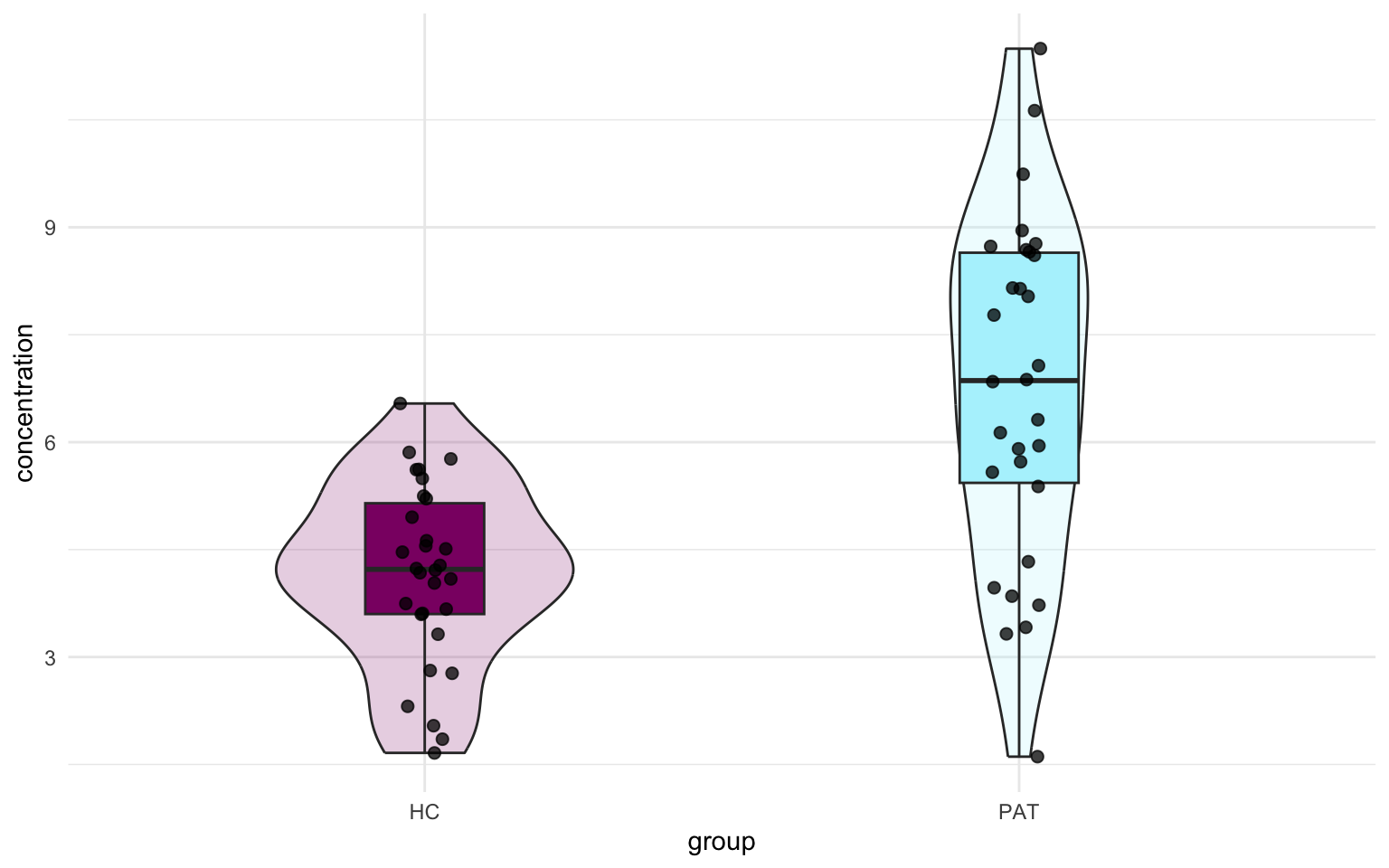
Great! Now we have a visual representation of the data. Now, since the T-test compares means, we can might also add a point indicating the mean for both groups. Let’s look just at the jittered points and add a line connecting the two mean values.
mean_concentration <- data |>
  group_by(group) |>
  summarise(mean_conc = mean(concentration))

ggplot(data, aes(x = group)) +
  geom_jitter(aes(y = concentration),
    width = 5e-2,
    size = 2, alpha = 0.75
  ) +
  geom_point(
    data = mean_concentration, aes(y = mean_conc),
    color = "violet", size = 5
  ) +
  geom_line(
    data = mean_concentration, aes(y = mean_conc), group = 1,
    linewidth = 2, color = "violet"
  ) +
  theme_minimal()
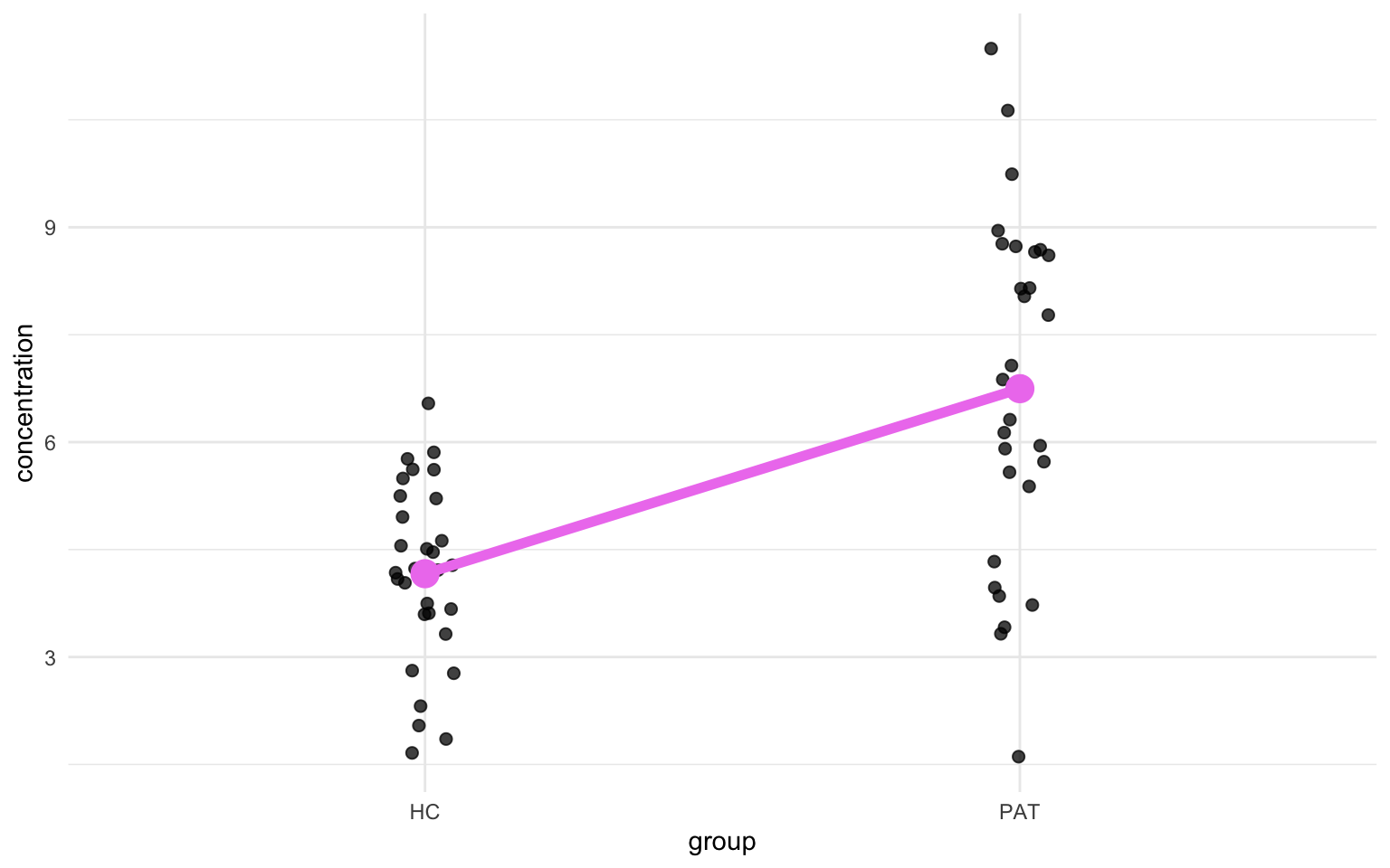
You might see where we are going with this. The parameters from the linear model will describe the angle of the diagonal line and I’ll illustrative this a further down. Let’s get the values from the linear model:
tst_model <- lm(concentration ~ group, data = data)
summary(tst_model)
Call:
lm(formula = concentration ~ group, data = data)

Residuals:
    Min      1Q  Median      3Q     Max
-5.1374 -1.0563  0.0861  1.3999  4.7476

Coefficients:
            Estimate Std. Error t value Pr(>|t|)
(Intercept)   4.1628     0.3468  12.005  < 2e-16 ***
groupPAT      2.5834     0.4904   5.268 2.11e-06 ***
---
Signif. codes:  0 '***' 0.001 '**' 0.01 '*' 0.05 '.' 0.1 ' ' 1

Residual standard error: 1.899 on 58 degrees of freedom
Multiple R-squared:  0.3236,    Adjusted R-squared:  0.312
F-statistic: 27.75 on 1 and 58 DF,  p-value: 2.11e-06
First of all, let’s look at the groupPAT, there we find the same $t$-value as we did when we ran the T-tests earlier, although with the sign flipped. I’ll show later why that is.
Now, back to the plot. The x-axis has two conditions: HC and PAT, but let’s imagine those values are 0 and 1. Let’s now also throw back to the time we recalled the formula for a straight line: $y = ax + c$. In this context we only have two x-values, HC and PAT or 0 and 1. Then we can obtain $y$ in the formula by solving the equation when $x$ is equal to 0, in that case $y$ becomes just the mean concentration of the healthy controls, or the big magenta dot in the previous plot, and that is a value we can calculate. Remember that 0 in the formula below stands for HC. That looks something like this:
$$ \begin{eqnarray} \overline{x}_{0} &=& a \times 0 + c \newline c &=& \overline{x}_{0} \newline &=& 4.162838 \end{eqnarray} $$
So that’s the constant our formula. If we look back at the output from the lm() function, we see that this value is represented as the Estimate of the (Intercept) row! Let’s also solve $a$. Remember that $a$ represents the slope of the line. How do we get the slope? The slope is basically nothing more than the difference between the mean values of HC and PAT, but let’s solve it in a more elegant way, by using the same formula we used to find c. We’ll use the same coding as before, 0 for HC and 1 for PAT. Remember that c is equal to the mean value of HC (aka $\overline{x}_{0}$).
$$ \begin{eqnarray} \overline{x}_{1} &=& a \times 1 + c \newline &=& a + \overline{x}_{0} \newline a &=& \overline{x}_{1} - \overline{x}_{0} \newline &=& 6.746285 - 4.162838 \newline &=& 2.583447 \end{eqnarray} $$
And then we find that $a$ is equal to the Estimate column for the groupPAT row.
We can reverse engineer the $t$-value too using just the output from the lm() function. One can imagine that if one would plot a situation where the null hypothesis (H0) is true, the slope of that line would be 0 since then there’s no difference between the mean of the two groups. We’ll take the difference between our observed slope, or the slope of the alternative hypothesis (H0), and the slope of the null hypothesis, which is 0, and divide that by the standard error of the sampling distribution, which is given by the lm() function as the Std. Error of the groupPAT row:
$$ \begin{eqnarray} t &=& \frac{slope~of~regression~line~at~H_{a} - slope~of~regression~line~at~H_{0}}{standard~error~of~sampling~distribution}\newline &=& \frac{1.6177 - 0}{0.3952} = 4.093 \end{eqnarray} $$
Which as you’ll notice is one thousandths-decimal place off, which is due to rounding errors. lm() reports up to 4 decimal points while it uses more for the calculation. And now we’ve come full circle, because the slope of the regression line is nothing more than the difference between the mean of the second group minor the mean of the first group. Now we can go back to the figure we made earlier and see how all these values relate:
Show code
ggplot(data, aes(x = group)) +
  geom_jitter(aes(y = concentration),
    width = 5e-2,
    size = 2, alpha = 0.75
  ) +
  geom_point(
    data = mean_concentration, aes(y = mean_conc),
    color = "violet", size = 5
  ) +
  geom_line(
    data = mean_concentration, aes(y = mean_conc),
    group = 1, linewidth = 2, color = "violet"
  ) +
  geom_segment(
    data = NULL, aes(
      x = 0.4, xend = 0.925,
      y = mean(g1), yend = mean(g1)
    ),
    color = "grey", linewidth = 0.2
  ) +
  geom_segment(
    data = NULL,
    aes(
      x = 0.4, xend = 1.925,
      y = mean(g2), yend = mean(g2)
    ),
    color = "grey", linewidth = 0.2
  ) +
  geom_text(
    data = data.frame(),
    aes(x = 1.45, y = 0.18 + (mean(g1) + mean(g2)) / 2),
    label = "a = 1.6177", angle = 21
  ) +
  scale_y_continuous(
    breaks = round(c(seq(2.5, 10, 2.5), mean(g1), mean(g2)), 4),
    minor_breaks = seq(1.25, 8.75, 2.5)
  ) +
  theme_minimal()
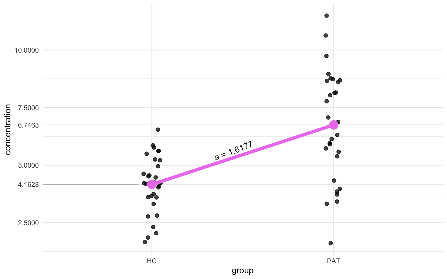
And that’s how a Two-Sample T-test is basically a linear model!
ANOVA
Based on what we did in the previous section, you may already predict what we’ll do in this section. Instead of one or two groups, we’ll now show how this works for more than two groups. The mathematics becomes a bit more long-winded and the visualizations a bit less clear, so we’ll just stick with the R code. Let’s for instance say we have four groups of patients and each have a certain score on a questionnaire:
n <- 30
data <- tibble(
  score = round(c(
    rnorm(n, mean = 75, sd = 30),
    rnorm(n, mean = 60, sd = 35),
    rnorm(n, mean = 30, sd = 17),
    rnorm(n, mean = 45, sd = 32)
  )),
  group = rep(c("SCZ", "BD", "MDD", "ASD"), each = n)
) |>
  mutate(group = as_factor(group))
Those of you that have used the aov() function before might have noticed the similarity in syntax between aov() and lm(), this is not a coincidence. The aov() function in R is actually just a wrapper for the lm() function, the anova() function reports the ANOVA calculations. That’s why I just want to compare them both side-by-side now. Let’s run the ANOVA first:
aov_model <- aov(score ~ group, data = data)
summary(aov_model)
             Df Sum Sq Mean Sq F value   Pr(>F)
group         3  47872   15957   17.79 1.45e-09 ***
Residuals   116 104058     897
---
Signif. codes:  0 '***' 0.001 '**' 0.01 '*' 0.05 '.' 0.1 ' ' 1
And then the linear model:
anova_lm_model <- lm(score ~ group, data = data)
summary(anova_lm_model)
Call:
lm(formula = score ~ group, data = data)

Residuals:
    Min      1Q  Median      3Q     Max
-66.100 -16.692   1.717  20.525  88.400

Coefficients:
            Estimate Std. Error t value Pr(>|t|)
(Intercept)   73.600      5.468  13.460  < 2e-16 ***
groupBD      -15.500      7.733  -2.004 0.047365 *
groupMDD     -54.133      7.733  -7.000 1.77e-10 ***
groupASD     -30.633      7.733  -3.961 0.000129 ***
---
Signif. codes:  0 '***' 0.001 '**' 0.01 '*' 0.05 '.' 0.1 ' ' 1

Residual standard error: 29.95 on 116 degrees of freedom
Multiple R-squared:  0.3151,    Adjusted R-squared:  0.2974
F-statistic: 17.79 on 3 and 116 DF,  p-value: 1.448e-09
The first thing you might notice is that the $F$-statistic and the $p$-value are the same in both models.
ref_mean <- data |>
filter(group == "SCZ") |>
pull(score) |>
mean()
anova_group_means <- data |>
group_by(group) |>
summarise(score = mean(score)) |>
mutate(
ref_mean = ref_mean,
mean_adj = score - ref_mean
)
ggplot(data, aes(x = group, y = score - ref_mean)) +
stat_summary(
fun = mean, geom = "point",
size = 10, color = "violet", shape = 18
) +
geom_jitter(width = 0.2) +
ggtext::geom_richtext(
data = anova_group_means,
aes(label = str_glue("x̄ = {round(mean_adj, 2)}")),
fill = "#ffffff80", nudge_x = 1 / 3
) +
theme_minimal()
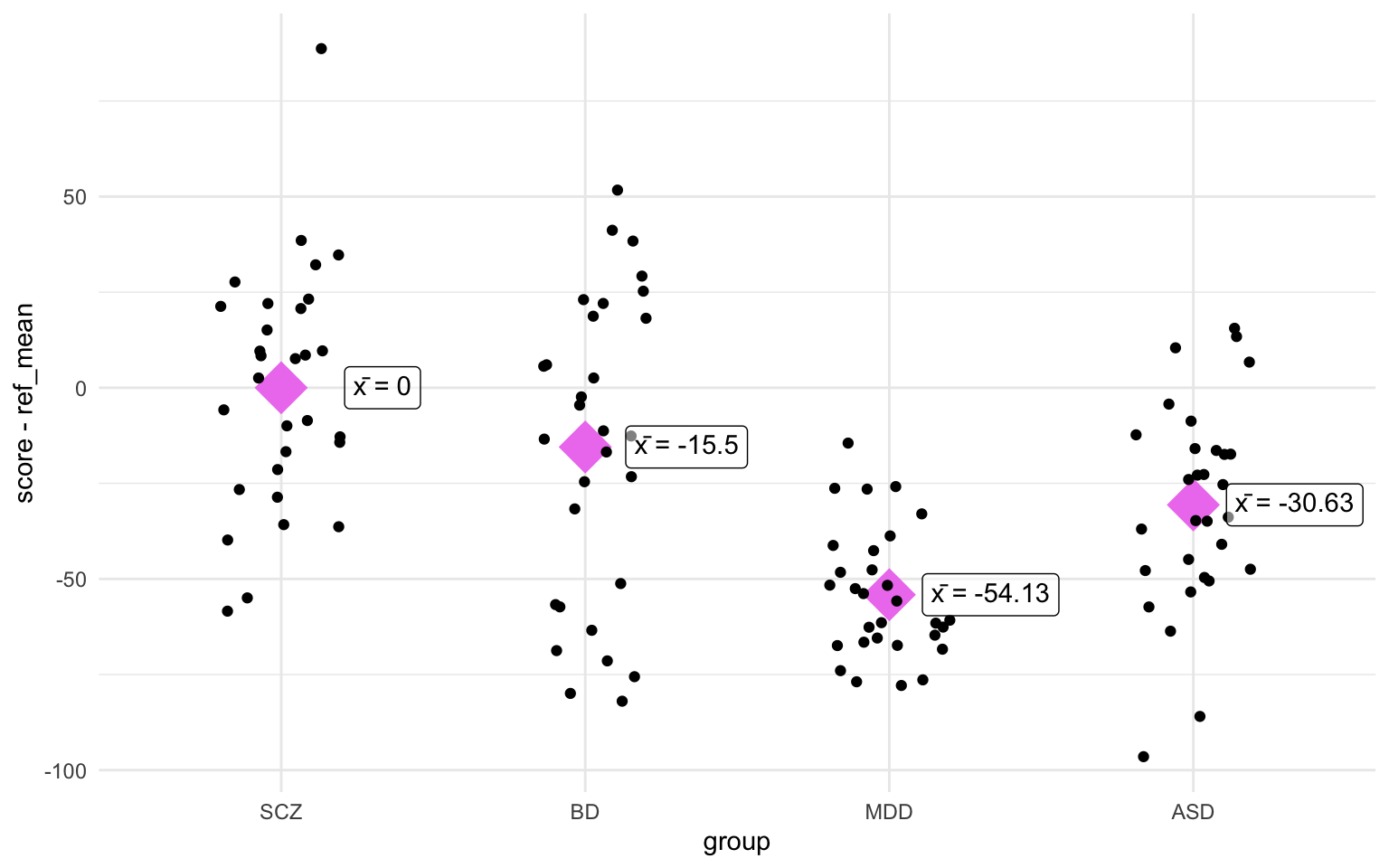
Oh, would you look at that! The differences between the group means and the reference mean (in this case SCZ) correspond with the Estimate of the linear model! Let’s also see if we can reproduce the sum of squares from the ANOVA summary. We’ll go a bit more in depth into the sum of squares further down, but I just wanted to go over a few formulas and calculations:
$$ \begin{eqnarray} total~sum~of~squares &=& \sum\limits_{j=1}^{J} n_{j} \times (\overline{x}_{j} - \mu)^2 \newline residual~sum~of~squares &=& \sum\limits_{j=1}^{J} \sum\limits_{i=1}^{n_{j}} (y_{ij} - \overline{y}_{j})^2 \end{eqnarray} $$
Just briefly, the first formula takes the mean value for the group in question, subtracts the overall mean (or grand mean) and squares the result. Then it multiplies this number by the sample size in this group. In this case we’ll only do it for the first group since that’s the one listed in the summary(aov_model) output. The second formula calculates the residual sum of squares (or sum of squared error). In essence it substracts the group mean from each of the individual values, squares it, and sums it first within the group, and then sums it again across the groups.
We can do both calculations in one go with the following quick code:
data |>
  mutate(overall_mean = mean(score)) |>
  group_by(group) |>
  summarise(
    group_mean = mean(score),
    group_n = n(),
    overall_mean = first(overall_mean),
    sq_group = group_n * (group_mean - overall_mean)^2,
    sq_error = sum((score - group_mean)^2)
  ) |>
  ungroup() |>
  summarise(
    ss_group = sum(sq_group),
    ss_error = sum(sq_error)
  )
# A tibble: 1 × 2
  ss_group ss_error
     <dbl>    <dbl>
1   47872.  104058.
Now look back at the output from summary(aov_model) and we’ll find the same values! I’ll leave it here for now, but we’ll come back to sum of squares (of different varieties later).
A linear model is a linear model
Well that’s a statement of unequaled wisdom, isn’t it? No wonder they give us doctorates to talk about this stuff.
I don’t think I need a lot of effort to convince anyone that a linear model is a linear model. Actually, I’m so convinced that you are aware that a linear model is a linear model that I wanted to about something else instead. Instead I wanted to dive into residuals and R2. Before we start, let’s first simulate some data, We’ll create an age column, a sex column, and a measure column. We’ll make it so that the measure column correlates with the age column.
n <- 20
data <- tibble(
  age = round(runif(n = n, min = 18, max = 60)),
  sex = factor(
    sample(c("Male", "Female"),
      size = n, replace = TRUE
    ),
    levels = c("Male", "Female")
  )
) |>
  mutate(measure = 1e-2 * age + sqrt(1e-2) * rnorm(n))
We’ve used the formula for a straight line in previous sections ($y = ax + c$), we can apply it here too, but instead of the difference in the mean between two groups, the slope of the line (denoted by $a$) is now derived from the slope at which the line has the least distance to all points, referred to as the best fit. We will plot this later, but first we should maybe just run the linear model:
lm_model <- lm(measure ~ age, data = data)
summary(lm_model)
Call:
lm(formula = measure ~ age, data = data)

Residuals:
      Min        1Q    Median        3Q       Max
-0.148243 -0.079997 -0.002087  0.053822  0.234803

Coefficients:
             Estimate Std. Error t value Pr(>|t|)
(Intercept) -0.049454   0.089850  -0.550    0.589
age          0.011142   0.002026   5.499  3.2e-05 ***
---
Signif. codes:  0 '***' 0.001 '**' 0.01 '*' 0.05 '.' 0.1 ' ' 1

Residual standard error: 0.1083 on 18 degrees of freedom
Multiple R-squared:  0.6268,    Adjusted R-squared:  0.6061
F-statistic: 30.24 on 1 and 18 DF,  p-value: 3.196e-05
We find that there is a significant association between age and our measure, and the R2 is about 47%. Recall that R2 denotes the amount of variance explained by the predictor, or age in our case. We can plot the linear model in ggplot with the geom_smooth() function, and then setting the method to "lm":
ggplot(data, aes(x = age, y = measure)) +
  geom_point(size = 4, alpha = 0.8) +
  geom_smooth(method = "lm", color = "grey30") +
  scale_x_continuous(limits = c(18, 60)) +
  theme_minimal()
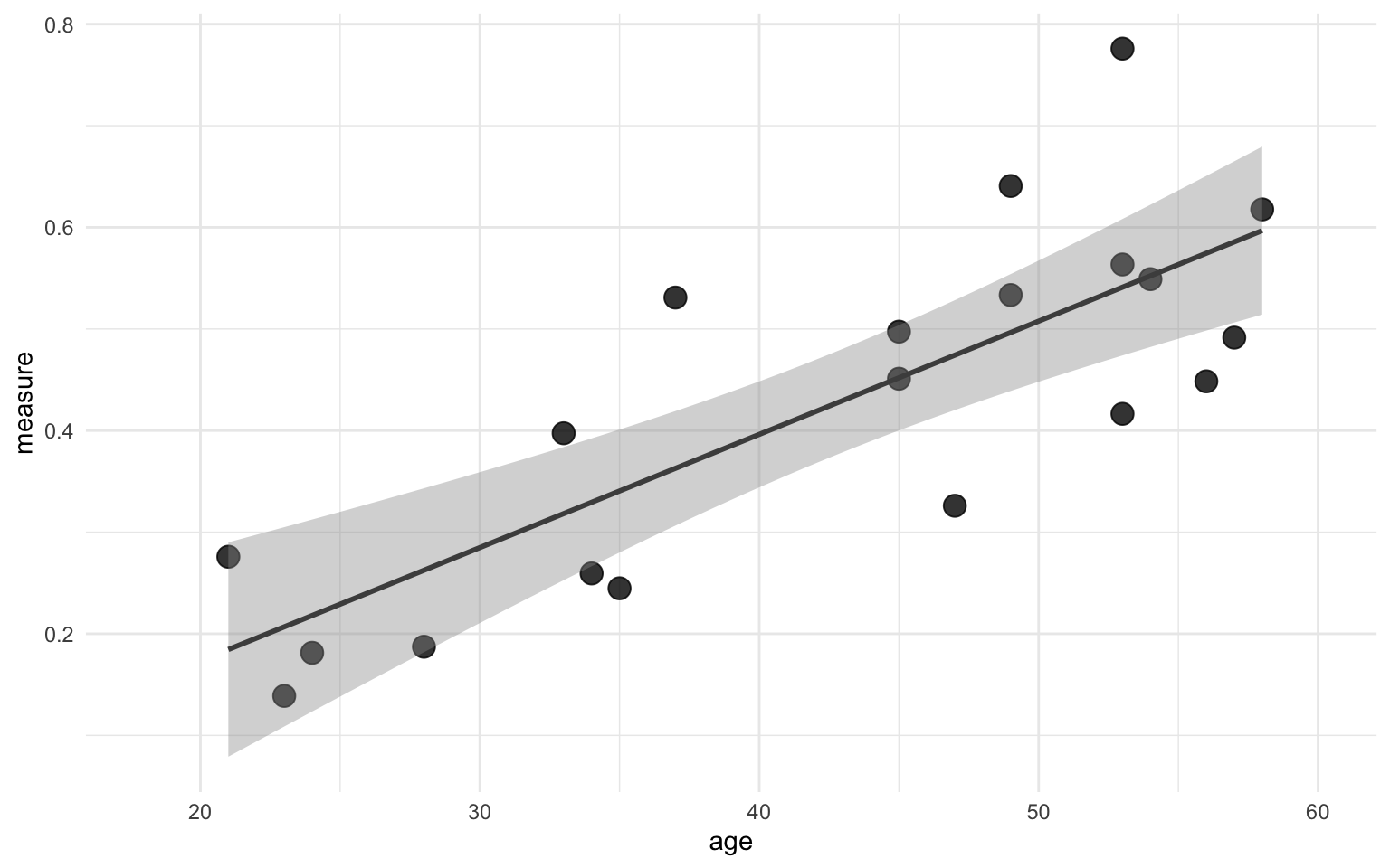
The line in the figure above shows the line that best fits the points with a ribbon indicating the standard error.
Back to our data. We know that a linear models fits a line that “predicts” outcome based on some other variable. This is heavily simplified, but it’ll make clear what we’ll do next. So what we did before with the best fit line was create one line that best fits all the data points, but now we want to relate that back to our data points. What would our values be if they would be exactly on this line? To get this, all we have to do is calculate the difference between the current data point and the value of the best fit line at the corresponding “predictor” value. We could do it by hand, but since this section is quite long already, I’ll skip straight to the R function, which is appropriately called predict.lm(). It takes the linear model we created with the lm() function earlier as input. It outputs a vector with the predicted values based on the model.
data <- data |>
  mutate(measure_pred = predict.lm(lm_model))
With that we can quickly calculate the residual standard error (oversimplified, it’s a measure of how well a regression model fits a dataset). The formula for the residual standard error is this:
$$ Residual~standard~error = \sqrt{\frac{\sum(observed - predicted)^2}{degrees~of~freedom}} $$
or in R terms (the degrees of freedom is 18 here, too complicated to explain for now):
sqrt(sum((data$measure - data$measure_pred)^2) / 18)
[1] 0.1082947
So that checks out. What we can then also do is calculate the difference between the observed and the predicted values values, this is called the residual:
data <- data |>
  mutate(residual = measure - measure_pred)
We can check that this is correct too by comparing the residuals we calculated with the output from the predict.lm() function to the output of the residuals(lm_model):
tibble(
  residual_manual = data$residual,
  residual_lm = residuals(lm_model)
) |>
  glimpse()
Rows: 20
Columns: 2
$ residual_manual <dbl> 0.020849595, 0.144178221, -0.075260734, -0.036675981, …
$ residual_lm     <dbl> 0.020849595, 0.144178221, -0.075260734, -0.036675981, …
Predictably, when we sum all the individual differences (or residuals) we would get 0 (allowing for rounding errors) since the regression line perfectly fits in between the datapoints.
sum(data$residual)
[1] 1.970646e-15
We can visualize the residuals using the geom_smooth() function. First I just want to show the difference visually in the scatter plot we had before. I added points along the regression line to indicate where each point will move to, and an arrow to indicate the size and the direction of the difference between the observed and the predicted value:
Show code
ggplot(data, aes(x = age)) +
  geom_smooth(aes(y = measure), method = "lm", color = "grey30") +
  geom_point(aes(y = measure), size = 4, alpha = 0.8) +
  geom_point(aes(y = measure_pred), alpha = 0.5, size = 2.5) +
  geom_segment(aes(xend = age, y = measure, yend = measure_pred),
    arrow = arrow(length = unit(4, "points")),
    color = "black", alpha = 0.8, show.legend = FALSE
  ) +
  scale_x_continuous(limits = c(18, 60)) +
  scico::scale_color_scico_d() +
  theme_minimal()
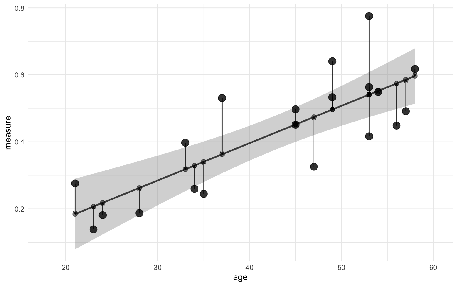
You might have noticed now that the size of the arrow is defined as the difference between the observed and predicted value, i.e. the residual! Now, you might have come across the term “sum of squared error” in different textbooks. With the values that we’ve calculated so far we can illustrate where this comes from. Imagine that the arrow in the figure above is one side of a square. How do you get the area of a suqare? You multiply the length of one side of the square by itself, i.e. you square it! That’s where the “squared error” part of that comes from. Perhaps the figure below helps illustrate it:
Show code
ggplot(data, aes(x = age)) +
  geom_smooth(aes(y = measure), method = "lm", color = "grey30") +
  geom_point(aes(y = measure), size = 4, alpha = 0.8) +
  geom_point(aes(y = measure_pred), alpha = 0.5, size = 2.5) +
  geom_segment(aes(xend = age, y = measure, yend = measure_pred),
    arrow = arrow(length = unit(4, "points")),
    color = "black", alpha = 0.8, show.legend = FALSE
  ) +
  geom_rect(
    data = . %>% filter(age < 35 & age > 30),
    aes(
      xmin = age, xmax = age - (1.6 * residual * age),
      ymin = measure_pred, ymax = measure
    ),
    alpha = 0.5, color = "grey30"
  ) +
  geom_rect(
    data = . %>% filter(age == 50),
    aes(
      xmin = age, xmax = age - (1.1 * residual * age),
      ymin = measure_pred, ymax = measure
    ),
    alpha = 0.5, color = "grey30"
  ) +
  scale_x_continuous(limits = c(18, 60)) +
  scico::scale_color_scico_d() +
  theme_minimal()
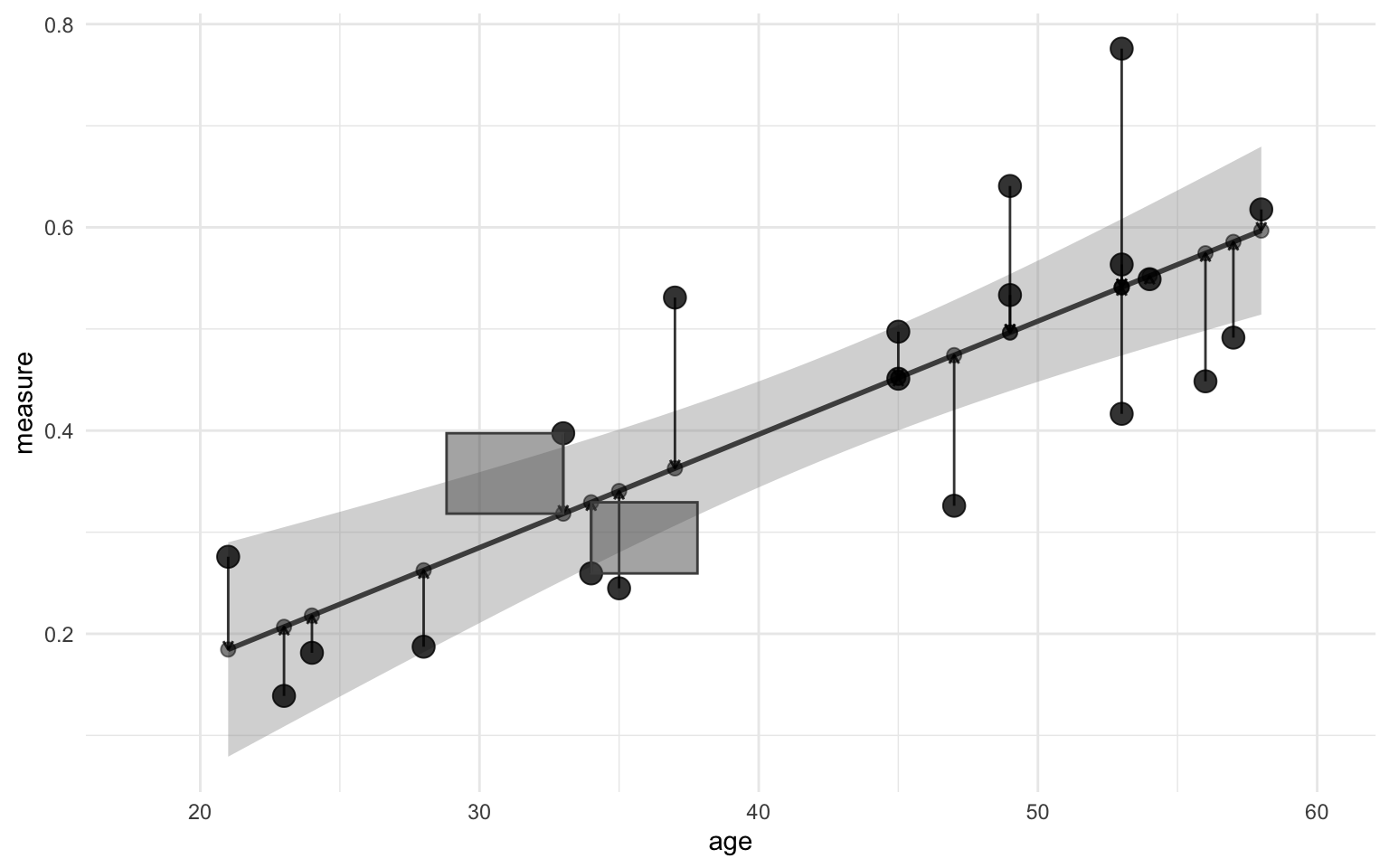
The “sum” part of “sum of squared error” refers to the sum of the areas of those squares. Simply, you sum the square of the sides. You can also look at it in mathematical form:
$$ \sum{(residual~or~difference~with~regression~line^2)} $$
In order to calculate the squared regression coefficient, we should also calculate the mean value of the measure across all points. This is necessary because the squared regression coefficient is defined as a perfect correlation (i.e. a correlation coefficient of 1) minus the explained variance divided by the total variance, or in formula form:
$$ \begin{eqnarray} R^2 &=& perfect~correlation - \frac{explained~variance}{total~variance} \newline &=& 1 - \frac{\sum(difference~with~regression~line^2)}{\sum(difference~with~mean~value^2)} \end{eqnarray} $$
Explained variance is defined here as the sum of squared error. You might notice the sum symbols and the squares, so you might guess that this formula is also some kind of sum of squares, and it is! As we already discovered, the numerator in this formula is the sum of squared error, the denominator is referred to as the sum of squared total. And the composite of those two is referred to as the sum of squared regression. Making three different sum of squares.
Important here is to notice that the error term has switched from the difference between the values with the group mean (as in ANOVA) to the difference between the values and the regression line. Where in the linear model the predicted value was the regression line, in the ANOVA is represented as group mean instead.
We’ve already plotted the sum of squared error, now we’ll also illustrate sum of squared total. Remember the sum of squared total is the sum of squared differences between the observed values and the mean value. I’ll also add the original regression line in the background to show the difference with the sum of squared error.
Show code
ggplot(data, aes(x = age)) +
  geom_smooth(aes(y = measure),
    method = "lm",
    color = "grey95", alpha = 0.1
  ) +
  geom_hline(
    yintercept = mean(data$measure),
    color = "grey30", linewidth = 1
  ) +
  geom_point(aes(y = measure), size = 4, alpha = 0.8) +
  geom_point(aes(y = mean(measure)), alpha = 0.5, size = 2.5) +
  geom_segment(
    aes(
      xend = age, y = measure,
      yend = mean(measure)
    ),
    arrow = arrow(length = unit(4, "points")),
    color = "black", alpha = 0.8, show.legend = FALSE
  ) +
  theme_minimal()
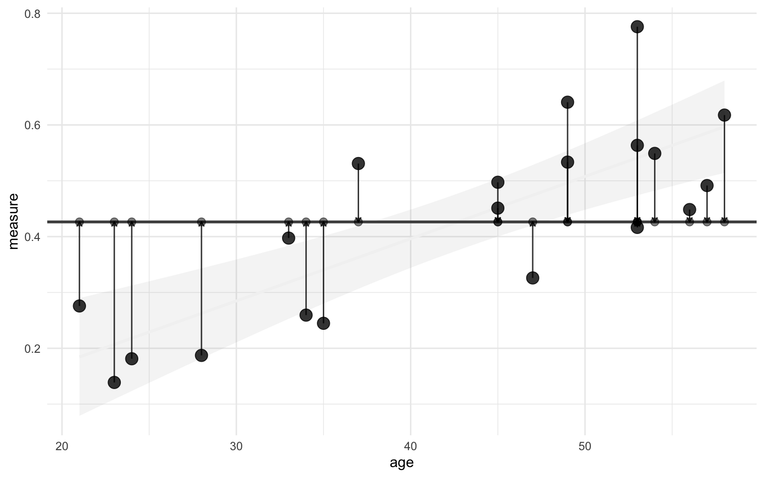
We already calculated the difference with the regression line, then to calculate the difference with the mean is simple:
data <- data |>
  mutate(
    measure_mean = mean(measure),
    difference_mean = measure - measure_mean
  )
Sidenote, if you wanted to calculate the total variance the formula for that would look like this:
$$ S^2 = \frac{\sum(x_{i} - \overline{x})^2}{n - 1} $$
Notice how the numerator is the same calculation as the sum of squared total, then divided by the sample size minus 1 (like the degrees of freedom).
To calculate the squared regression coefficient (R2) from the formula above is then simple. We take 1 (perfect correlation) and subtract the sum of the squared residuals (explained variance) divided by the sum of the squared difference with the mean (total variance). In R terms, that would look like this:
1 - sum(data$residual^2) / sum(data$difference_mean^2)
[1] 0.6268363
And there we have it, the regression coefficient R2! You can check that it’s the same by scrolling up to where we ran summary(lm_model) and you’ll find the same number. We could also calculate the F-statistic and the $t$- and $p$-values, but I think this tutorial has drained enough cognitive energy. For this last section, I hope it’s become clear what we mean when we talk about “residuals”, “sum of squares”, and “variance” in the context of linear models. I also hope it’s enlightened you a bit on what a linear model does and how it works.
Conclusion
There’s many more things we could go over, multiple linear regression, non-parametric tests, etc., but I think we have done enough nerding for today. I hope I managed to show you the overlap in different statistical tests. Does that mean that you should only run linear models for now? No, of course not. But I do think it may be good to have an overview of where the values you get come from and what they might mean in different contexts. Hope this was enlightening. Happy learning!
Resources
Common statistical tests are linear models (or: how to teach stats) - Jonas Kristoffer Lindeløv
STAT 415: Introduction to Mathematical Statistics - Penn State Department of Statistics
Session info for reproducibility purposes
sessionInfo()
R version 4.3.2 (2023-10-31)
Platform: x86_64-apple-darwin20 (64-bit)
Running under: macOS Sonoma 14.2

Matrix products: default
BLAS:   /Library/Frameworks/R.framework/Versions/4.3-x86_64/Resources/lib/libRblas.0.dylib
LAPACK: /Library/Frameworks/R.framework/Versions/4.3-x86_64/Resources/lib/libRlapack.dylib;  LAPACK version 3.11.0

locale:
[1] en_US.UTF-8/en_US.UTF-8/en_US.UTF-8/C/en_US.UTF-8/en_US.UTF-8

time zone: Europe/Oslo
tzcode source: internal

attached base packages:
[1] stats     graphics  grDevices datasets  utils     methods   base

other attached packages:
 [1] patchwork_1.1.3 lubridate_1.9.3 forcats_1.0.0   stringr_1.5.0
 [5] dplyr_1.1.3     purrr_1.0.2     readr_2.1.4     tidyr_1.3.0
 [9] tibble_3.2.1    ggplot2_3.4.4   tidyverse_2.0.0

loaded via a namespace (and not attached):
 [1] utf8_1.2.4        generics_0.1.3    renv_1.0.3        xml2_1.3.5
 [5] lattice_0.22-5    stringi_1.7.12    hms_1.1.3         digest_0.6.33
 [9] magrittr_2.0.3    evaluate_0.22     grid_4.3.2        timechange_0.2.0
[13] fastmap_1.1.1     Matrix_1.6-1.1    jsonlite_1.8.7    ggtext_0.1.2
[17] mgcv_1.9-0        fansi_1.0.5       scales_1.2.1      scico_1.5.0
[21] cli_3.6.1         rlang_1.1.1       splines_4.3.2     commonmark_1.9.0
[25] munsell_0.5.0     withr_2.5.1       yaml_2.3.7        tools_4.3.2
[29] tzdb_0.4.0        colorspace_2.1-0  vctrs_0.6.4       R6_2.5.1
[33] lifecycle_1.0.3   pkgconfig_2.0.3   pillar_1.9.0      gtable_0.3.4
[37] glue_1.6.2        Rcpp_1.0.11       xfun_0.40         tidyselect_1.2.0
[41] rstudioapi_0.15.0 knitr_1.44        farver_2.1.1      nlme_3.1-163
[45] htmltools_0.5.6.1 rmarkdown_2.25    labeling_0.4.3    compiler_4.3.2
[49] markdown_1.11     gridtext_0.1.5