How I Create Manhattan Plots Using ggplot
24 April 2019
Introduction
There are many ways to create a Manhattan plot. There’s a number of online tools that create Manhattan plots for you, it’s implemented in a number of toolboxes that are often used in genetics, and there’s a couple of packages for R that can create these plots. However, these options often don’t offer the customizability that some people (like me) would want. One of the most flexible ways to plot a Manhattan plot (I know of) is the {manhattan} package, but how nice would it be to have full control over the properties of the plot. Therefore, whenever I need to create a Manhattan plot, my preference is to go to the awesome {ggplot2} package. In my opinion, it gives me more control over the lay-out and properties of the Manhattan plot, so I thought I’d go through how I go about creating Manhattan plots in R using the {ggplot2} package. I’ve tried this code on GWAS summary statistics from several sources, and it works for a bunch of them. Because data can look somewhat different, I’ll describe the concept behind some of the code, as to show what my reasoning is behind each step. One thing I should point out is that it’s probably best to run this code on a computer that is a little bit powerful, since it will need to deal with an enormous amount of SNPs, that will create massive dataframes and plot objects.
Import data into R
The first step, as always, is to load the packages we need. I personally prefer to use as little packages as possible and write most of the code myself, because that gives me total control over what happens to my data. However, there are some packages (in particular some of the packages developed by Hadley Wickham) that are very powerful. So, all code described below depends on one of two packages, the {tidyverse} package, which includes the {ggplot2} and {dplyr} package. Next, I load the file that contains the GWAS summary statistics. Different tools use different file formats. The file I use is the output from PLINK with the --meta-analysis flag. This file can simple be loaded as a table. Here I use a function from our own {normentR} package, called simulateGWAS(), which does as the name suggest, and simulate the output from a GWAS analysis.
library(tidyverse)
library(ggtext)
library(normentR)
set.seed(2404)

gwas_data_load <- simulateGWAS(nSNPs = 1e6, nSigCols = 3) |>
  janitor::clean_names()
GENERATING SIMULATED GWAS DATASET
1. Generating random rs IDs
2. Generate list of N per SNP
3. Generating BETA
4. Generating SE
5. Generating R^2
6. Generating T-values
7. Generating P-values
8. Adding significant column in chromosome 4
9. Adding significant column in chromosome 5
10. Adding significant column in chromosome 7
DONE!
This will create a dataframe with as many rows as there are SNPs in the summary statistics file. The columns and column names depend on what tools and functions have been used. But it should at least have a column with the chromosome (probably called CHR), the position of the SNP on the chromosome (probably called BP), the p-value (in a column called P), and the SNP name (in a column aptly named SNP). There can be multiple columns with differently weighted or corrected p-values. I usually use just the regular normal P column. Since I don’t like capital letters in column names, I use the clean_names() function from the {janitor} package to clean those up. This function replaces all capital letters with lowercase letters in a clean way and adds underscores where appropriate.
A vast majority of the datapoints will overlap in the non-significant region of the Manhattan plot, these data points are not particularly informative, and it’s possible to select a random number of SNPs in this region to make it less computationally heavy. The data I used here does not have such a large volume, so I only needed to filter a small number of SNPs (10% in this case).
sig_data <- gwas_data_load |>
  subset(p < 0.05)

notsig_data <- gwas_data_load |>
  subset(p >= 0.05) |>
  group_by(chr) |>
  sample_frac(0.1)

gwas_data <- bind_rows(sig_data, notsig_data)
Preparing the data
Since the only columns we have indicating position are the chromosome number and the base pair position of the SNP on that chromosome, we want to combine those so that we have one column with position that we can use for the x-axis. So, what we want to do is to create a column with cumulative base pair position in a way that puts the SNPs on the first chromosome first, and the SNPs on chromosome 22 last. I create a data frame frame called data_cum (for cumulative), which selects the largest position for each chromosome, and then calculates the cumulative sum of those. Since we don’t need to add anything to the first chromosome, we move everything one row down (using the lag() function). We then merge this data frame with the original dataframe and calculate a the cumulative basepair position for each SNP by adding the relative position and the adding factor together. This will create a column (here called bp_cum) in which the relative base pair position is the position as if it was stitched together. This code is shown below:
data_cum <- gwas_data |>
  group_by(chr) |>
  summarise(max_bp = max(bp)) |>
  mutate(bp_add = lag(cumsum(max_bp), default = 0)) |>
  select(chr, bp_add)

gwas_data <- gwas_data |>
  inner_join(data_cum, by = "chr") |>
  mutate(bp_cum = bp + bp_add)
When this is done, the next thing I want to do is to get a couple of parameters that I’ll use for the plot later. First, I want the centre position of each chromosome. This position I’ll use later to place the labels on the x-axis of the Manhattan plot neatly in the middle of each chromosome. In order to get this position, I’ll pipe the gwas_data dataframe into this powerful {dplyr} function which I then ask to calculate the difference between the maximum and minimum cumulative base pair position for each chromosome and divide it by two to get the middle of each chromosome. I also want to set the limit of the y-axis, as not to cut off any highly significant SNPs. If you want to compare multiple GWAS statistics, then I highly recommend to hard code the limit of the y-axis, and then explore the data beforehand to make sure your chosen limit does not cut off any SNPs. Since the y-axis will be log transformed, we need an integer that is lower than the largest negative exponent. But since the y-axis will be linear and positive, I transform the largest exponent to positive and add 2, to give some extra space on the top edge of the plot. When plotting, I actually convert it back to a log scale, but it’s a bit easier to add a constant to it by transforming it to a regular integer first.
Then, we also want to indicate the significance threshold, I prefer to save this in a variable. Here, I choose to get a Bonferroni-corrected threshold, which is 0.05 divided by the number of SNPs in the summary statistics. Usually, I would use the “default” threshold of 0.05 divided by 1e-6 which is 5e-8. However, in the data I had I believed it to be best to use the Bonferroni-corrected threshold to be a little bit more conservative given the dataset I had. These three parameters were calculated as follows:
axis_set <- gwas_data |>
  group_by(chr) |>
  summarize(center = mean(bp_cum))

ylim <- gwas_data |>
  filter(p == min(p)) |>
  mutate(ylim = abs(floor(log10(p))) + 2) |>
  pull(ylim)

sig <- 0.05 / nrow(gwas_data_load)
Plotting the data
Finally, we’re ready to plot the data. As promised, I use the ggplot() function for this. I build this up like I would any other ggplot object, each SNP will be one point on the plot. Each SNP will be colored based on the chromosome. I manually set the colors, add the labels based on the definitions I determined earlier, and set the y limits to the limit calculated before as well. I add a horizontal dashed line indicating the significance threshold. In Manhattan plots we really don’t need a grid, all that would be nice are horizontal grid lines, so I keep those but remove vertical lines. Manhattan plots can be a bit intimidating, so I prefer them as minimal as possible. Shown below is the code I use to create the plot and to save the plot as an image.
manhplot <- ggplot(gwas_data, aes(
  x = bp_cum, y = -log10(p),
  color = as_factor(chr), size = -log10(p)
)) +
  geom_hline(
    yintercept = -log10(sig), color = "grey40",
    linetype = "dashed"
  ) +
  geom_point(alpha = 0.75) +
  scale_x_continuous(
    label = axis_set$chr,
    breaks = axis_set$center
  ) +
  scale_y_continuous(expand = c(0, 0), limits = c(0, ylim)) +
  scale_color_manual(values = rep(
    c("#276FBF", "#183059"),
    unique(length(axis_set$chr))
  )) +
  scale_size_continuous(range = c(0.5, 3)) +
  labs(
    x = NULL,
    y = "-log<sub>10</sub>(p)"
  ) +
  theme_minimal() +
  theme(
    legend.position = "none",
    panel.grid.major.x = element_blank(),
    panel.grid.minor.x = element_blank(),
    axis.title.y = element_markdown(),
    axis.text.x = element_text(angle = 60, size = 8, vjust = 0.5)
  )
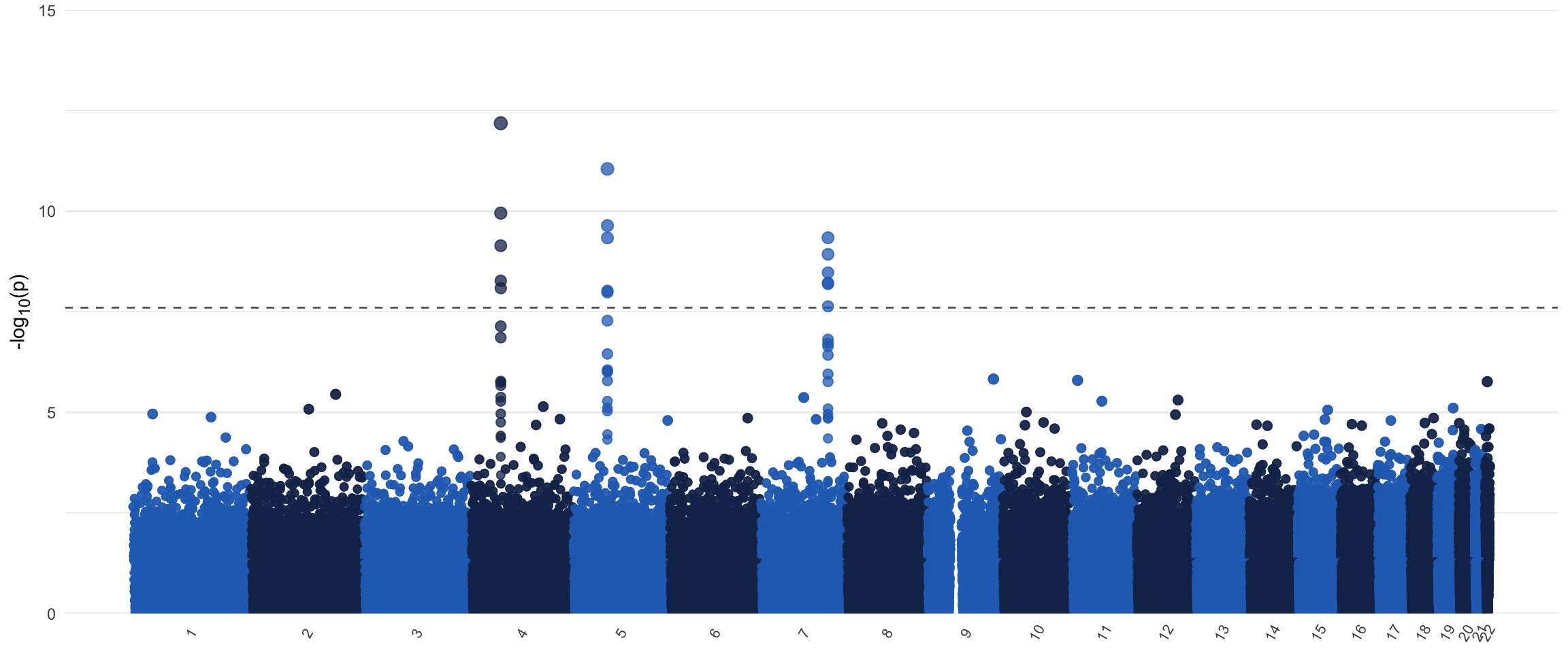
I opt to include some white space on the x-axis around the Manhattan plot to give it some space to “breathe”, but this is personal preference. This white space can be removed by adding expand = c(0,0) to the scale_x_continuous() function to get a more compact plot. I also added a size aesthetic. It is possible to render the plot once it’s created, but due to the size of the object, in this instance I’d recommend to directly save it to a .png file instead of a pdf. It’s possible to save it to a pdf anyway, but due to the size of the object, this will be an enormous file, but of course this depends on the resources at your disposal. If you do save it as an image, I personally like to save it in a ratio that is wider than it is tall. This is both for aesthetic reasons, and to prevent the labels on the x-axis to clash for the chromosomes of shorter length. Of course, this being a ggplot() object, it’s possible to add onto this at will. One thing that you can do is to manually annotate the plot using the annotate(), geom_text(), or the geom_label_repel() function. The latter is implemented in the {ggrepel} package, and is actually quite a neat function. Do make sure to only annotate a selected number of SNPs, otherwise it will likely crash your session! I’ve included a Manhattan plot of some simulated data below to show how it turned out for me when I ran the code described above.
print(manhplot)
EDIT (2021-03-26): Had to revisit some old code because I have now adopted better practices in both naming conventions and coding style. I moved away from using periods in variable names. I practically always use janitor::clean_names() to turn messy/ugly variable names into clean variable names. I also removed the (rather slow) for-loop in favor of a more elegant (I think) tidyverse solution. Biggest change that’ll actually affect the result is in first section, where we remove superfluous datapoints with a high p-value. Here I now added the simple group_by(chr) line that’ll make the split in the final plot less visible (try it both with and without that line to see what the difference is). I also adjusted the text according to the code updates. You can still access the older version in the history of the GitHub repository (danielroelfs/danielroelfs.com). It’s kinda fun to revisit older code and see how my process has improved, hope it’ll help you too!