How I Plot ERPs in R
30 March 2019
Introduction
Plotting ERPs is one of the essential skills in EEG neuroscience. There are many possible ways of going about this task, some better than others. Myself, I use either MATLAB or R to plot ERPs. In my experience, MATLAB is by far the preferred method since most of the EEG analysis takes place in MATLAB already, but I believe that there’s some merit to using R. One of my main arguments is aesthetics. Using for instance the {ggplot2} package for the ERP adds a more unified look if you’re using ggplot for the rest of the visualizations of the statistics as well. Another argument could be that it’s easier to add statistical information to the ERP. When I read EEG articles, I find that the ERP plots are sometimes difficult to read, and that they don’t supply any information about the statistical error in the grand averaged ERP. Of course, I have my own code for plotting grand averaged ERP in MATLAB showing the confidence interval for each ERP too, but I find it easier and prettier in R.
However, MATLAB is the gold standard within EEG research and getting the data from MATLAB to R requires some trickery. I could not possibly claim that the code I use is the best way to do this. I’m 100% sure there are probably better, quicker, and more elegant ways available of going about this, but I could not find such code on the internet. That’s why I thought I’d share my method of going about it, but again please keep in mind that there are probably better ways of going about this.
At this point I also feel the obligation to point out that a package called erp.easy exists that was purpose built for working with ERPs and ERP statistics in R. However, I couldn’t get it to work with my data, so that’s where the necessity for me came from to build my own code. I’ll share my code underneath and I’ll annotate the code where necessary.
library(tidyverse)
library(normentR)
Loading the data
Since I cannot share participants’ data, I used an open EEG dataset downloaded here, this data comes from a psychophysics group of 5 participants with 2 conditions. It came in the EEGLAB format, same as my own data. The first step is to take the data out of MATLAB and take it to a format that can be easily understood by R. The most convenient way I thought of was to take the EEG.data field, transform it into a two-dimensional metrix and store it in a .csv file.
If you have a large amount of participants, I can recommend to only extract data from the channels of interest or the conditions of interest. One can make one file per channel or participant, or one large file that contains everything. I usually choose the latter, and that’s what I’ll work with here. So my file looks as follows: one column with the channel, one column with the ID, one with the condition (or trigger). If I’m doing a between-groups analysis, I’ll also have a column with the group. All the other columns are the amplitudes with across the timepoints. I also have a file with the timepoints for each value. i.e. with epoch of 500 milliseconds ranging from 100 milliseconds pre-stimulus to 400 milliseconds post-stimulus, all the timepoints according to the sampling rate are the values in this file. It is basically nothing more than a print of the values in the EEG.times field from the EEGLAB dataset. I’ll load this list of time points here also.
data <- read_delim("./data/all_channels_erp.txt",
  delim = "\t", col_names = FALSE
)

times <- read_table("./data/times.txt", col_names = FALSE)
janitor package helps cleaning up column names, in this instance it converts all default columns (e.g. V1) to lowercase (i.e. v1)erp_data <- data |>
janitor::clean_names() |>
rename(
channel = v1,
id = v2,
condition = v3
) |>
mutate(
id = as_factor(id),
condition = as_factor(condition)
)
Preparing the data
Then I specify a variable with the channels of interest. These will be the channels I’ll average across later.
coi <- c("P1", "P2", "Pz", "P3", "P4", "PO3", "PO4", "POz")
Then I calculate the means across channels and conditions. This goes in two steps. First I’ll select only the channels of interest, then I’ll group by ID, condition, and channel. And then calculate the average of every other column, in this case all columns starting with “v”. Then I’ll do the same, except now I’ll group by ID and condition. So then we have one average ERP for every condition in all participants.
summarise() function will throw a warning about the grouping variable, this can be silenced by setting .groups = "drop"erp_data_chan_mean <- erp_data |>
filter(channel %in% coi) |>
group_by(id, condition, channel) |>
summarise(across(starts_with("v"), ~ mean(.x, na.rm = TRUE))) |>
ungroup()
erp_data_cond_mean <- erp_data_chan_mean |>
group_by(id, condition) |>
summarise(across(starts_with("v"), ~ mean(.x, na.rm = TRUE))) |>
ungroup()
mean_erp <- erp_data_cond_mean
Calculate grand average and confidence interval
The next piece of code calculates the grand average. I will also add the time for each timepoint in milliseconds from the “times.txt” file we loaded earlier. Afterwards, I will alculate the confidence interval and then transform it from the interval relative to the mean to the absolute values representing the upper and lower boundaries of the confidence interval. Here I use a confidence interval of 95%. We first transform from wide to long format using the pivot_longer() function from the {tidyr} package. I merge the data frame containing the times to the long data frame with the mean ERP so that we have a column with numerical time points. Then we calculate the average amplitude per time point. Then using the CI() function from the {Rmisc} package, we calculate the upper and lower bounds of the confidence interval and add each as a separate column in the data frame.
times <- times |>
  pivot_longer(
    cols = everything(),
    names_to = "index", values_to = "time"
  ) |>
  mutate(timepoint = str_glue("v{row_number() + 3}")) |>
  select(-index)

erp_plotdata <- mean_erp |>
  pivot_longer(
    cols = -c(id, condition),
    names_to = "timepoint", values_to = "amplitude"
  ) |>
  inner_join(times, by = "timepoint") |>
  group_by(condition, time) |>
  summarise(
    mean_amplitude = mean(amplitude),
    ci_lower = Rmisc::CI(amplitude, ci = 0.95)["lower"],
    ci_upper = Rmisc::CI(amplitude, ci = 0.95)["upper"]
  )
Preparing to plot
Before we can start plotting, I just wanted to share one piece of code I found on StackOverflow. The question there was to move the x-axis and y-axis line towards 0, rather than the edge of the plot. You can find the question (and answers) here. I combined two answers into a function that moves both the y- and the x-axis to 0. It is my personal preference to have a line indicating 0. This makes the plots easier to read and looks prettier too, but of course this is subjective. Alternatively we could also add a geom_hline() and geom_vline(), both with intercept at 0, and turn the axes off (as default in theme_norment(). This will still give you the lines at x=0 and y=0 but will keep the axis labels at 0.
I personally prefer to have a plot that is as clean as possible, to really put focus on the ERP curve. So I’d typically turn off the grid lines. I also remove one of the 0-ticks to avoid any awkward overlay with the axes, especially since the 0 is also indicated by the axis line already.
I take the colors from our own {normentR} package. I ask for two colors from the “logo” palette.
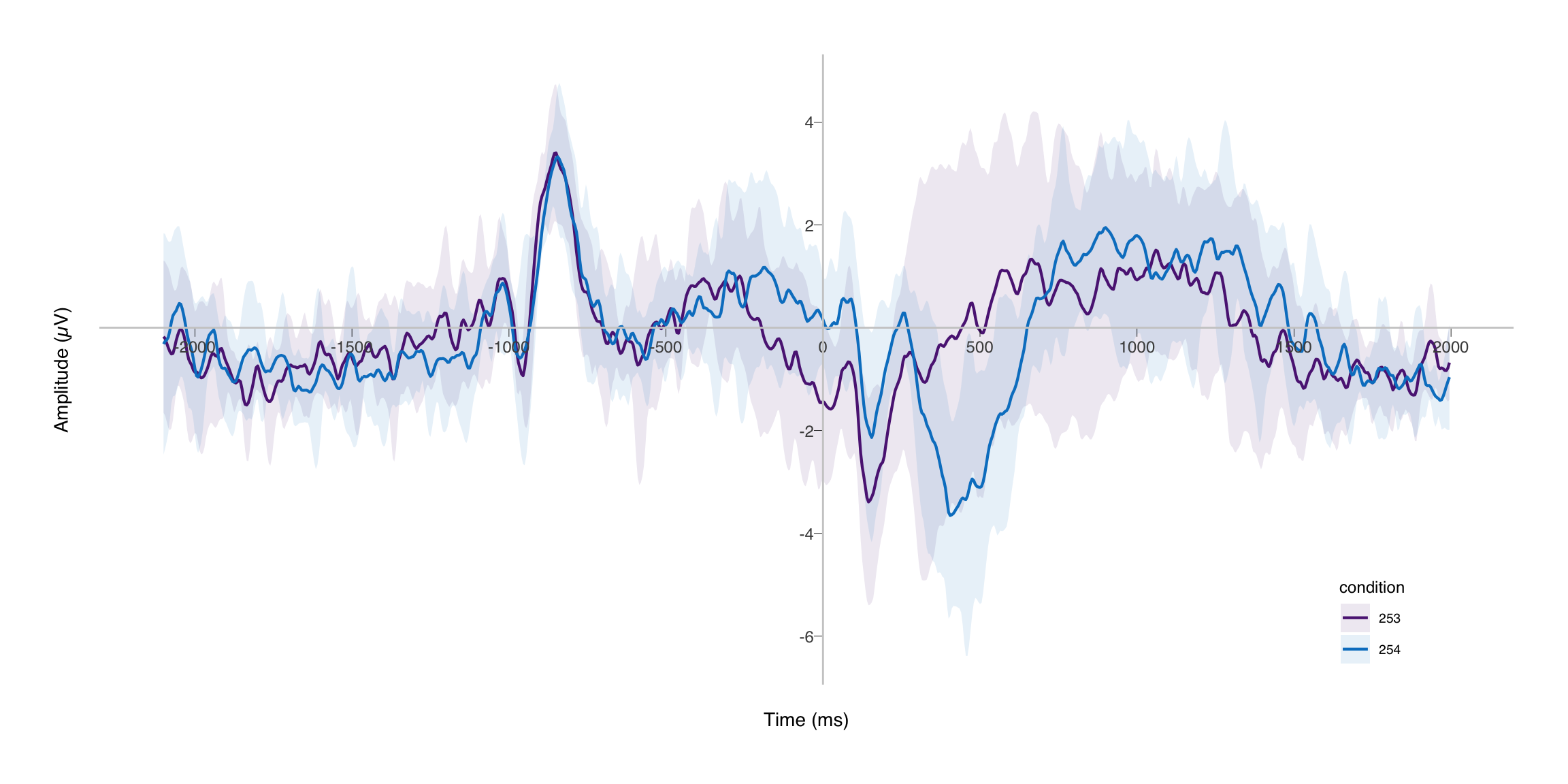
After running the chunk below, we have a beautiful ERP with a nice confidence interval. I hope this was helpful and informative. Good luck!
colors <- norment_pal(palette = "logo")(2)

erp_plot <- ggplot(erp_plotdata, aes(
  x = time, y = mean_amplitude,
  colour = condition, group = condition
)) +
  geom_ribbon(aes(ymin = ci_lower, ymax = ci_upper, fill = condition),
    alpha = 0.1, linetype = 0
  ) +
  geom_line(linewidth = 0.75) +
  scale_color_manual(values = colors) +
  scale_fill_manual(values = colors) +
  scale_x_continuous(breaks = c(seq(-2000, 2000, 500))) +
  scale_y_continuous(breaks = c(seq(-12, -1, 2), seq(2, 12, 2))) +
  coord_cartesian() +
  labs(
    x = "Time (ms)",
    y = "Amplitude (µV)"
  ) +
  theme_norment(ticks = TRUE, grid = FALSE) +
  theme(
    legend.position = c(0.9, 0.1),
    axis.text.x = element_text(vjust = -0.1)
  )
shift_axes(erp_plot, x = 0, y = 0)
EDIT (2023-10-30): In the process of making some general updates to this site, I also revisited some of the code here. I improved the standard somewhat from when I first wrote this post in 2019 and brought it up to the code standards of 2023. The old version is of course available on GitHub.