Visualizing the Dutch elections throughout the night
22 November 2023
So it’s time again for the Netherlands to have another election for the Dutch parliament (Tweede Kamer) The previous one was only in 2021, and we had elections in 2023 already for the Provinces and indirectly for the Dutch “Senate” (Eerste Kamer), but the parliamentary elections are the most important ones, usually taking place every four years (until one of the coalition partners believes they cannot support the government anymore, or if one of parties in government believe it’s in their best interest to have another election sooner rather than later).
Anyway, parliamentary elections are a prime example of how and why data vizualization is important. Data is used extensively throughout the political campaigns to get political points across (whether it’s used justly or disingenuously). For data analysts and data journalists, vizualizing the polls, results, and trends as the data comes in is a key challenge throughout the night. Since this is a unique event that happens (hopefully) only once every four years, so I thought I’d jump on the opportunity to provide my (admittedly unrequested) take on the data visualizations that are important to share.
The plots I’ll share here are a bit more complicated than the usual ones (especially in cases where I actively try to recreate a plot), so I’ll hide the code to each plot by default, but you can see the code by clicking “Show code” or “Show code for the plot”.
I’ll also separate this post in when I added the new plots and data. I’ll mark the (general) time I added a new section.
21 November
Some of the plots I could create beforehand, this data about the polls leading up to election dayy. I also made sure to create a few datasets that might help me speed up the work during election night. So I’ll add color and accent colors and their political identity. First, I’ll load the packages we’ll use here. I’ll also load a custom font I’ll use for the plots.
Show code
library(tidyverse)
library(ggtext)
library(rvest)
library(showtext)
library(patchwork)

font_add_google("Bitter", family = "custom")
showtext_auto()
Then we can create a data frame with the party names and their identifying colors. I’ll also add their political identity, i.e. how far left or right the parties are and how progressive or conservative the parties are. This data comes from the webpage the political landscape from the Dutch voting advice website KiesKompas which offers one of the most popular application that helps voters identify what parties their values most closely align with. It’s a tool by the Vrije Universiteit Amsterdam (VU Amsterdam) and is generally well-respected. However, their political landscape is a bit controversial because it tends to “average” across a set of issues, while perhaps ignoring some of the key identifying issue a party is campaigning on (historically e.g. immigration and the PVV).
One more complication here is that two parties, GroenLinks (GL) and the Partij van de Arbeid (PvdA), campaigned under a single banner, referred to here as GL-PvdA. When comparing to previous elections, polls and election outcomes should probably be summed across those two parties to better reflect the trends.
Show code
data_parties <- tribble(
  ~party, ~leftright, ~progcon, ~color, ~text_color,
  "VVD", 50, -32, "#EE6F2D", "#333333",
  "D66", -5, 58, "#4DAA4F", "#333333",
  "GL-PvdA", -55, 66, "#CD3029", "grey95",
  "PVV", 9, -74, "grey92", "#333333",
  "CDA", 23, -24, "#62C45D", "#333333",
  "SP", -77, 21, "#DA3732", "grey95",
  "FvD", 64, -92, "#9B2820", "grey95",
  "PvdD", -95, 82, "#317142", "grey95",
  "CU", -32, 21, "#46A4E2", "#333333",
  "Volt", -14, 84, "#4A2975", "grey95",
  "JA21", 77, -89, "#242C54", "grey95",
  "SGP", 27, -42, "#DA632C", "#333333",
  "DENK", -68, 32, "#50B4B1", "#333333",
  "50PLUS", -23, -3, "#8C3D83", "grey95",
  "BBB", 9, -42, "#9DBD43", "#333333",
  "BIJ1", -95, 92, "#FFFD54", "#333333",
  "BVNL", 100, -89, "#1D2540", "grey95",
  "NSC", -9, -8, "#121439", "grey95"
)

data_historical_parties <- tribble(
  ~party, ~hist_leftright, ~hist_progcon, ~hist_color, ~hist_text_color,
  "PvdA", -65, 50, "#D22C21", "grey95",
  "GroenLinks", -70, 68, "#5BA546", "#333333",
  "ChristenUnie", -32, 21, "#47A6E5", "#333333",
)
Recreating the political compass is fairly simple once the data is loaded. It’s in principle simply a scatterplot. Making it look informative by labeling the points directly and adding the colors and annotations in an informative matter is the only challenge here.
Show code
compass_text <- tribble(
  ~leftright, ~progcon, ~label,
  -100, 5, "Left",
  80, 5, "Right",
  2, 96, "Progressive",
  2, -96, "Conservative"
)

data_parties |>
  mutate(party = str_replace(party, "-", "-\n")) |>
  ggplot(aes(x = leftright, y = progcon, color = color)) +
  geom_hline(yintercept = 0, color = "#333333") +
  geom_vline(xintercept = 0, color = "#333333") +
  geom_text(
    data = compass_text, aes(label = label),
    size = 5, color = "#333333",
    hjust = 0, fontface = "bold", family = "custom"
  ) +
  geom_point(size = 16) +
  geom_text(
    aes(label = party, color = text_color),
    size = 4, lineheight = 1,
    fontface = "bold", family = "custom"
  ) +
  labs(
    title = "**Dutch political spectrum**",
    x = NULL,
    y = NULL,
    caption = "**Source**: KiesKompas"
  ) +
  scale_x_continuous(
    limits = c(-100, 100),
    labels = NULL,
    expand = expansion(add = 0)
  ) +
  scale_y_continuous(
    limits = c(-100, 100),
    labels = NULL,
    expand = expansion(add = 0)
  ) +
  scale_color_identity() +
  coord_equal(clip = "off") +
  theme_minimal(base_family = "custom") +
  theme(
    text = element_text(color = "#333333"),
    plot.title.position = "plot",
    plot.title = element_markdown(size = 32, margin = margin(l = -50)),
    plot.caption.position = "plot",
    plot.caption = element_markdown(margin = margin(t = 10, r = -50)),
    panel.grid = element_blank()
  )
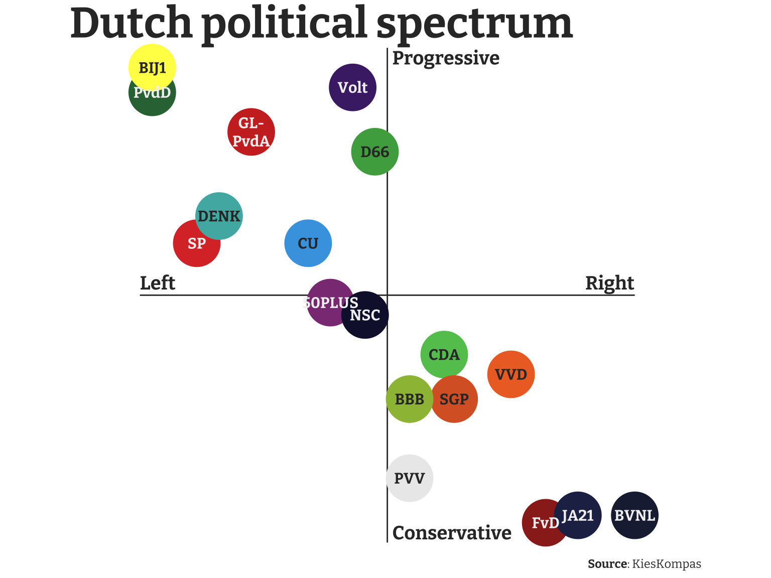
It’s immediately visible that the political parties (as broken down by KiesKompas) are aligned across a diagonal from right and conservative to left and progressive. Parties that are both left-wing and conservative, or right-wing and progressive are not really present in the mainstream Dutch political system (or in most foreign ones as far as I’m aware). There are three parties in the lower-right corner (FvD, JA21, and BVNL). JA21 and BVNL are both factions that left the FvD after internal disagreement. The PVV is perhaps best known internationally for their leader Geert Wilders. According to KiesKompas they are somewhere in the middle between left and right-wing, but in this case the party can probably be best described as populist, adapting both policies from the left and right. Internationally, they associate most with far-right parties and in the Netherlands they are also commonly called far-right.
The only squarely left-wing party of significance this election is the coalition GL-PvdA, led by former EU Commissioner Frans Timmermans.
Before I move to the lastest polls, I can show how the seats have been distributed across the political parties over the past election cycles. For this I’ll quickly scrape the parlement.com website for the seat distribution across the past few elections.
Show code
data_tk_history <- "https://www.parlement.com/id/vh8lnhronvx6/zetelverdeling_tweede_kamer" |>
  read_html() |>
  html_elements("table") |>
  html_table() |>
  first() |>
  janitor::clean_names() |>
  rename_with(~ str_glue("election_{str_sub(.x, 2, 5)}")) |>
  rename(party = election_arti) |>
  mutate(
    party = str_extract(party, "[^<!]+"),
    across(starts_with("election"), as.integer)
  )
Then we can merge this dataset with the metadata tibble I created earlier to get the colors so I can use them in plotting. This plot is a simple “time-series”-like plot using geom_path(). The biggest challenge here was to annotate all the parties properly. I chose for a combination of both labeling each line explicitly and adding a legend with the specification for each color. However, since many parties use very similar colors this legend alone was not enough.
Show code
data_tk_hist <- data_tk_history |>
  left_join(data_parties, by = "party") |>
  left_join(data_historical_parties, by = "party") |>
  mutate(
    color = coalesce(color, hist_color),
    text_color = coalesce(text_color, hist_text_color)
  )

legend_list <- data_tk_hist |>
  select(color, party) |>
  deframe()

data_tk_hist |>
  pivot_longer(starts_with("election"),
    names_to = "year", values_to = "seats"
  ) |>
  mutate(
    year = parse_number(year)
  ) |>
  ggplot(aes(x = year, y = seats, color = color)) +
  geom_hline(yintercept = 0, color = "#333333", alpha = 0.5) +
  geom_vline(
    xintercept = na.omit(names(data_tk_hist) |> parse_number()),
    color = "#333333", alpha = 0.5
  ) +
  geom_path(linewidth = 1, key_glyph = "point") +
  geom_point(size = 3) +
  ggrepel::geom_text_repel(
    data = . %>% slice_max(year),
    aes(label = party),
    xlim = c(2021, NA), min.segment.length = 0,
    hjust = 0, size = 3, fontface = "bold", family = "custom"
  ) +
  labs(
    title = "Historical seat distribution<br>in the past few elections",
    x = NULL,
    y = "Number of seats in parliament",
    color = NULL,
    caption = "**Source**: parlement.com"
  ) +
  scale_x_continuous(
    breaks = na.omit(names(data_tk_hist) |> parse_number()),
    expand = expansion(add = c(0, 1.5))
  ) +
  scale_y_continuous(
    expand = expansion(add = c(0, 2))
  ) +
  scale_color_identity(
    labels = legend_list,
    guide = guide_legend(override.aes = list(size = 5), nrow = 3)
  ) +
  coord_cartesian(clip = "off") +
  theme_minimal(base_family = "custom") +
  theme(
    text = element_text(color = "#333333"),
    plot.title = element_markdown(size = 20, face = "bold"),
    plot.title.position = "plot",
    plot.caption = element_markdown(),
    plot.caption.position = "plot",
    plot.margin = margin(l = 10, t = 10),
    legend.position = "bottom",
    panel.grid.major.x = element_blank(),
    panel.grid.minor.x = element_blank()
  )
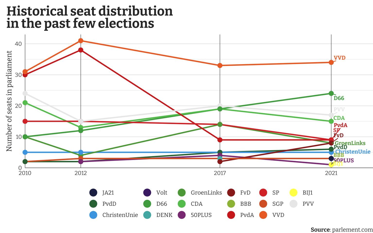
This plot immediately shows the dominance of the VVD, the party of Mark Rutte who is quite well-known internationally. The PvdA, which internationally associates with traditional labour parties, used to be the biggest opponent to the centre-right CDA and the right-wing VVD, but have since then failed to connect with the voters.
Let’s now also look at some polls to see what election night might bring. For this I’ll scrape the results from Ipsos. It contains the polls from week 44 and week 46.
Show code
data_polls_pre <- "https://www.ipsos.com/sites/default/files/nl/nl/politiekebarometer/Link_Tabel.html" |>
  read_html() |>
  html_elements("table") |>
  html_table(header = TRUE) |>
  first() |>
  janitor::clean_names() |>
  filter(nchar(x) > 0) |>
  rename(
    party = x,
    current_perc = tweede_kamer,
    current_seats = tweede_kamer_2,
    polls_perc_wk_44 = week_441_nov_23,
    polls_seats_wk_44 = week_441_nov_23_2,
    polls_perc_wk_46 = week_4615_nov_23,
    polls_seats_wk_46 = week_4615_nov_23_2
  ) |>
  mutate(across(-party, as.numeric))

data_polls_pre |> write_rds("./data/polls_wk_46.rds")
From this table I’ll use only the polls from week 46 (latest available at the time). To better compare the polls to the current situation without drowning out the most important data I’ll show the current seat distribution in grey, and the predicted seats in red.
Show code for the plot
data_polls_pre_new <- read_rds("./data/polls_wk_46.rds") |>
  bind_rows(
    read_rds("./data/polls_wk_46.rds") |>
      filter(party %in% c("GL", "PvdA")) |>
      summarise(
        party = "GL-PvdA", across(-party, sum)
      )
  ) |>
  group_by(party) |>
  summarise(across(everything(), sum)) |>
  filter(!party %in% c("GL", "PvdA")) |>
  mutate(party = case_when(
    str_detect(party, "50") ~ "50PLUS",
    str_detect(party, "VOLT") ~ "Volt",
    TRUE ~ party
  ))

data_polls_pre_new |>
  pivot_longer(
    cols = contains("seats"),
    names_to = "seats_var", values_to = "n_seats"
  ) |>
  filter(seats_var %in% c("current_seats", "polls_seats_wk_46")) |>
  ggplot(aes(x = n_seats, y = reorder(party, polls_perc_wk_46), fill = seats_var)) +
  geom_vline(xintercept = 0, color = "#333333") +
  geom_col(position = position_dodge(), key_glyph = "point") +
  geom_text(
    aes(x = n_seats - 0.5, label = n_seats),
    position = position_dodge(width = 1),
    color = "white", size = 3, family = "custom"
  ) +
  labs(
    title = "Predicted seat distribution from Week 46",
    x = NULL,
    y = NULL,
    fill = NULL,
    caption = "**Source**: Ipsos"
  ) +
  scale_x_continuous(
    position = "top",
    limits = c(0, NA),
    expand = expansion(add = c(0, NA))
  ) +
  scale_fill_manual(
    values = c("current_seats" = "grey60", "polls_seats_wk_46" = "firebrick"),
    labels = c("Current seats", "Predicted seats (wk 46)"),
    guide = guide_legend(override.aes = list(shape = 21, size = 6))
  ) +
  theme_minimal(base_family = "custom") +
  theme(
    plot.title.position = "plot",
    plot.title = element_markdown(size = 24, face = "bold"),
    plot.caption.position = "plot",
    plot.caption = element_markdown(),
    legend.position = c(0.8, 0.2)
  )
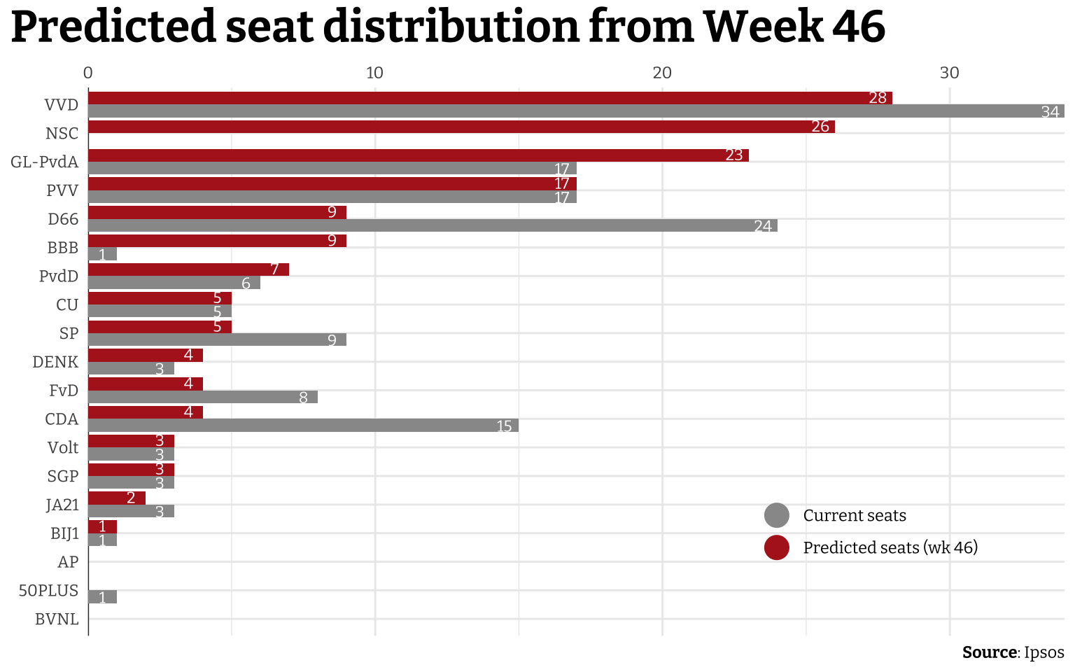
The biggest thing to notice here is the party NSC which was started by Pieter Omtzigt, formerly a member of the CDA. This party participates in the 2023 parliamentary elections for the first time, so it doesn’t have anything to compare to. According to these polls, the NSC will go in one go to 26 seats. The VVD is still the biggest, but loses a few seats. Other than the VVD, the biggest losers in these polls are the D66, CDA, FvD, and SP.
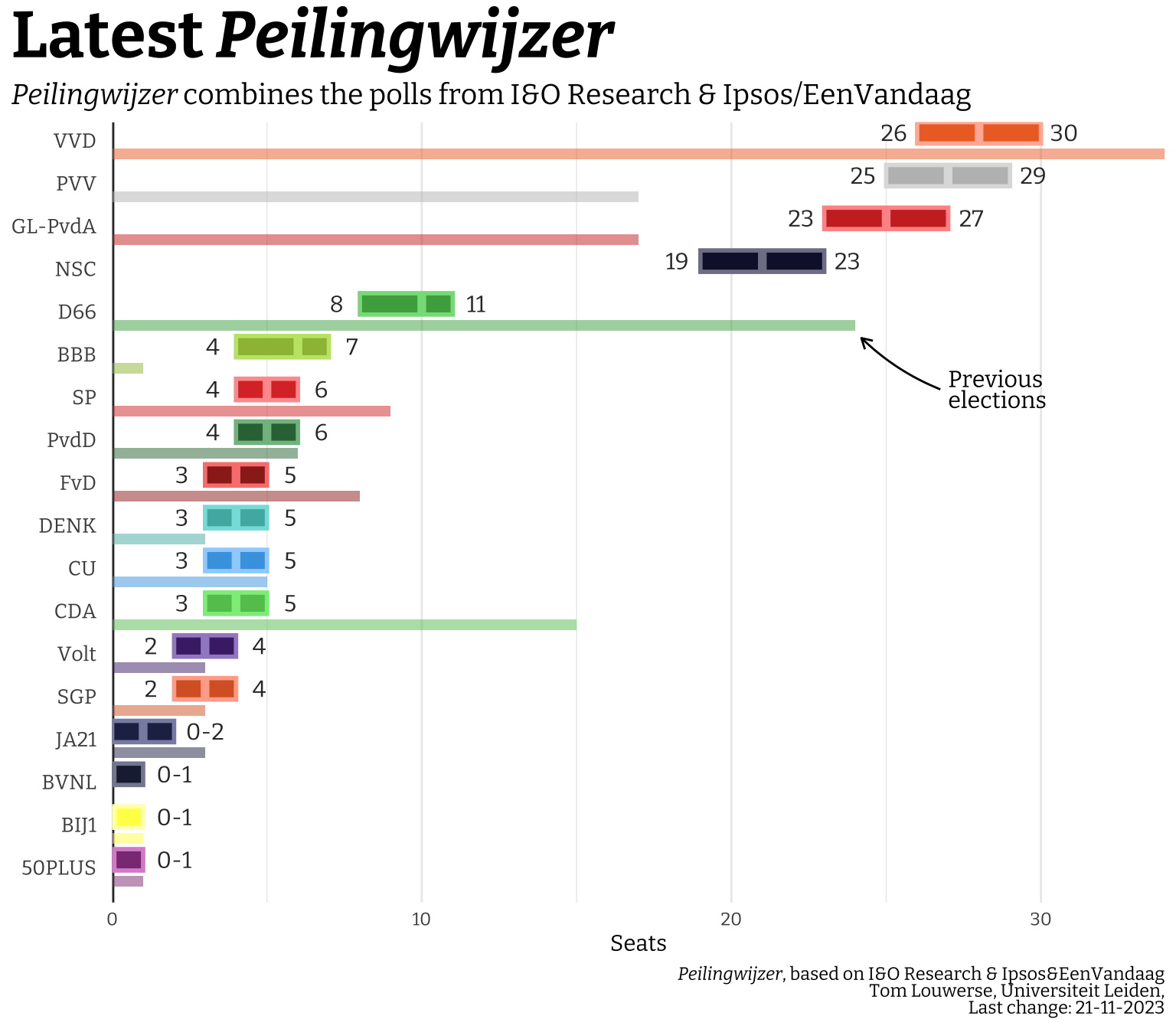
This is just one plot from one pollster. There is however a polling aggregator, called the Peilingwijzer, which is maintained by political scientist Tom Louwerse at Leiden University. It uses a Bayesian approach to weigh a collection of polls from various sources (description in Dutch and English). An (probably earlier) version of the code is available on Dataverse This way he gets a better estimate of the uncertainty across several pollsters and polling dates. I know he does a lot of his analyses in R, so I’ll try to recreate his plot on the main website just as a challenge (and perhaps make one or two things a bit more aesthetically pleasing). It seems he uses the somewhat niche (at least in my field) geom_crossbar().
Show code
polls_peilingwijzer <- tribble(
  ~party, ~range_min, ~range_max,
  "VVD", 26, 30,
  "PVV", 25, 29,
  "GL-PvdA", 23, 27,
  "NSC", 19, 23,
  "D66", 8, 11,
  "BBB", 4, 7,
  "SP", 4, 6,
  "PvdD", 4, 6,
  "CU", 3, 5,
  "CDA", 3, 5,
  "FvD", 3, 5,
  "DENK", 3, 5,
  "Volt", 2, 4,
  "SGP", 2, 4,
  "JA21", 0, 2,
  "BVNL", 0, 1,
  "BIJ1", 0, 1,
  "50PLUS", 0, 1,
)

polls_peilingwijzer |>
  inner_join(data_parties) |>
  inner_join(data_polls_pre_new |>
               select(party, current_seats)) |>
  mutate(
    color = ifelse(color == "grey92", "grey", color),
    range_max_label = ifelse(range_max <= 2,
      str_glue("{range_min}-{range_max}"), range_max
    )
  ) |>
  ggplot(aes(
    x = current_seats, y = reorder(party, range_max),
    color = color, fill = color
  )) +
  geom_vline(xintercept = 0, color = "#333333", linewidth = 1) +
  geom_col(color = "transparent", width = 0.25, alpha = 0.5, just = 2.5) +
  geom_crossbar(
    aes(
      x = range_min + round((range_max - range_min) / 2),
      xmin = range_min, xmax = range_max,
      color = colorspace::lighten(color, amount = 0.5)
    ),
    width = 0.5, linewidth = 1, fatten = 2
  ) +
  geom_text(
    aes(x = range_min, label = range_min),
    color = "#333333", size = 4, family = "custom",
    nudge_x = -0.75
  ) +
  geom_text(
    aes(x = range_max, label = range_max_label),
    color = "#333333", size = 4, family = "custom",
    nudge_x = ifelse(polls_peilingwijzer$range_max <= 2, 1, 0.75)
  ) +
  geom_text(
    data = tibble(),
    aes(x = 27, y = 12, label = "Previous\nelections"),
    inherit.aes = FALSE,
    size = 4, family = "custom",
    hjust = 0, lineheight = 0.75
  ) +
  geom_curve(
    data = tibble(),
    aes(x = 26.75, y = 12, xend = 24.2, yend = 13.2),
    inherit.aes = FALSE, curvature = -0.1,
    arrow = arrow(length = unit(0.4, "lines"))
  ) +
  labs(
    title = "Latest _Peilingwijzer_",
    subtitle = "_Peilingwijzer_ combines the polls from I&O Research & Ipsos/EenVandaag",
    x = "Seats",
    y = NULL,
    caption = "_Peilingwijzer_, based on I&O Research & Ipsos&EenVandaag<br>
    Tom Louwerse, Universiteit Leiden,<br>
    Last change: 21-11-2023"
  ) +
  scale_x_continuous(
    limits = c(0, NA),
    expand = expansion(add = c(0, NA))
  ) +
  scale_y_discrete(
    expand = expansion(add = c(1, 0))
  ) +
  scale_color_identity() +
  scale_fill_identity() +
  theme_minimal(base_family = "custom") +
  theme(
    plot.title.position = "plot",
    plot.title = element_markdown(size = 32, face = "bold"),
    plot.subtitle = element_markdown(size = 14),
    plot.caption.position = "plot",
    plot.caption = element_markdown(lineheight = 0.75),
    axis.text.y = element_markdown(size = 10, margin = margin(t = 10, r = 5)),
    panel.grid.major.y = element_blank()
  )
22 November 21:00
The voting booths (at least in the mainland part of the Netherlands) close at 21:00. This also marks the release of the first exit polls. I’m just copying the numbers from the TV broadcast as they come in and saving them in a tibble() using the tribble() function.
Show code for the plot
data_current_seats <- data_polls_pre_new |>
  select(party, current_perc, current_seats)

exit_polls_2100 <- tribble(
  ~party, ~polls_2100,
  "VVD", 23,
  "PVV", 35,
  "GL-PvdA", 26,
  "NSC", 20,
  "D66", 10,
  "BBB", 7,
  "SP", 5,
  "PvdD", 4,
  "CU", 3,
  "CDA", 5,
  "FvD", 3,
  "DENK", 2,
  "Volt", 2,
  "SGP", 3,
  "JA21", 1,
  "BVNL", 0,
  "BIJ1", 0,
  "50PLUS", 1
)

exit_polls_2100 |>
  inner_join(data_parties, by = "party") |>
  inner_join(data_current_seats, by = "party") |>
  pivot_longer(
    cols = c(polls_2100, current_seats),
    names_to = "variable", values_to = "seats"
  ) |>
  mutate(
    color = ifelse(str_detect(variable, "current"), "grey80", color),
    color = ifelse(color == "grey92", "grey40", color),
    text_color = ifelse(str_detect(variable, "polls") & party == "PVV",
      "white", text_color
    ),
    text_color = ifelse(str_detect(variable, "current"), "#333333", text_color)
  ) |>
  ggplot(aes(
    x = seats, y = reorder(party, current_perc),
    group = variable, fill = color
  )) +
  geom_col(position = position_dodge(), key_glyph = "point") +
  geom_vline(xintercept = 0, color = "#333333") +
  geom_text(
    aes(x = seats - 0.5, label = seats, color = text_color),
    position = position_dodge(width = 1),
    size = 3, family = "custom"
  ) +
  labs(
    title = "Exit polls from 22 November 22:00",
    subtitle = "Colored bars show the predicted number of seats,<br>grey bars indicate current seats",
    x = "Number of seats in parliament",
    y = NULL,
    fill = NULL,
    caption = "**Source**: Ipsos, comissioned by NOS and RTL"
  ) +
  scale_x_continuous(
    position = "top",
    limits = c(0, NA),
    expand = expansion(add = c(0, 2))
  ) +
  scale_color_identity() +
  scale_fill_identity() +
  theme_minimal(base_family = "custom") +
  theme(
    plot.title.position = "plot",
    plot.title = element_markdown(size = 24, face = "bold"),
    plot.subtitle = element_markdown(lineheight = 0.67),
    plot.caption.position = "plot",
    plot.caption = element_markdown(),
    axis.text.y = element_markdown(size = 10),
    legend.position = c(0.8, 0.2)
  )
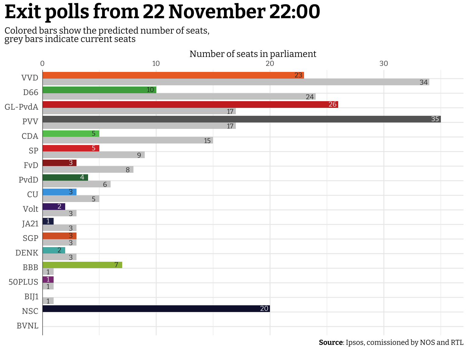
Out of the blue, contrary to basically any serious poll, the PVV party from Geert Wilders appears to become the largest party, followed by GL-PvdA. This is a major upset that would open the door for a very right and conservative government. This would unfortunately mean the latest blow to meaningful climate action, an increase anti-immigrant policy, decreased government support for Ukraine, increased support for Israel and the atrocities they commit in Gaza and the rest of Palestine, and possibly a host of challenges to the rule of law in the Netherlands.
22 November 22:00
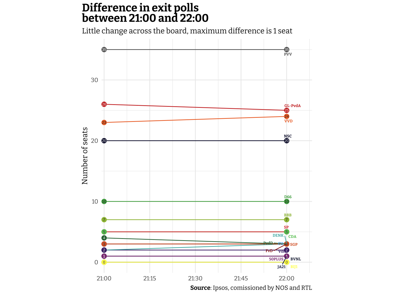
An hour later, at 22:00, the next exit polls was released. After the shock of the first one I think everyone was quite nervous to see whether these next exit polls were consistent with the first or if there was some course correction, but the second exit polls were very consistent. No party changed more than 1 seat in either direction compared to the polls released at 21:00. I’ll try to visualize the difference, showing how flat the differences are.
Show code for the plot
exit_polls_2200 <- tribble(
  ~party, ~polls_2200,
  "VVD", 24,
  "PVV", 35,
  "GL-PvdA", 25,
  "NSC", 20,
  "D66", 10,
  "BBB", 7,
  "SP", 5,
  "PvdD", 3,
  "CU", 3,
  "CDA", 5,
  "FvD", 3,
  "DENK", 3,
  "Volt", 2,
  "SGP", 3,
  "JA21", 1,
  "BVNL", 0,
  "BIJ1", 0,
  "50PLUS", 1
)

exit_polls_2200 |>
  inner_join(exit_polls_2100) |>
  inner_join(data_parties, by = "party") |>
  pivot_longer(
    cols = starts_with("polls"),
    names_to = "time", values_to = "seats"
  ) |>
  mutate(
    time = str_remove(time, "polls_"),
    time = lubridate::parse_date_time(time, "HM", tz = ""),
    color = ifelse(party == "PVV", "grey40", color),
    text_color = ifelse(party == "PVV",
      "white", text_color
    ),
  ) |>
  ggplot(aes(x = time, y = seats, color = color)) +
  geom_path() +
  geom_point(size = 3) +
  geom_text(
    aes(label = seats, color = text_color),
    size = 2
  ) +
  ggrepel::geom_text_repel(
    data = . %>% group_by(party) %>% slice_max(time),
    mapping = aes(label = party),
    hjust = 0, size = 2, seed = 42,
    max.overlaps = 20,
    fontface = "bold", family = "custom"
  ) +
  labs(
    title = "Difference in exit polls<br>between 21:00 and 22:00",
    subtitle = "Little change across the board, maximum difference is 1 seat",
    x = NULL,
    y = "Number of seats",
    caption = "**Source**: Ipsos, comissioned by NOS and RTL"
  ) +
  scale_x_datetime(
    expand = expansion(add = c(50, 500))
  ) +
  scale_color_identity() +
  theme_minimal(base_family = "custom") +
  coord_fixed(ratio = 120, clip = "off") +
  theme(
    plot.title.position = "plot",
    plot.title = element_markdown(size = 16, face = "bold"),
    plot.subtitle = element_markdown(lineheight = 0.67),
    plot.caption.position = "plot",
    plot.caption = element_markdown(),
    legend.position = c(0.8, 0.2)
  )
23 November
It’s the day after and basically all news agencies (e.g. NOS, BBC, CNN, NRK) are (justifiably) shocked by the fact that Geert Wilders likely will become the next prime minister in the Netherlands for however long his government will last. The formal results will be announced once all votes are properly tallied and checked again, so for this part of the analyses we can only rely on the latest results with almost all votes counted at least once. The official result will be published by the Kiesraad one about a week, but it publishes the preliminary results also, so I’ll just copy the data from there. I already created the absolute seat comparison, and since not much changed I thought perhaps I could look at the percentage change from the current seats.
Show code for the plot
preliminary_results <- tribble(
  ~party, ~prelim_results,
  "VVD", 24,
  "PVV", 37,
  "GL-PvdA", 25,
  "NSC", 20,
  "D66", 9,
  "BBB", 7,
  "SP", 5,
  "PvdD", 3,
  "CU", 3,
  "CDA", 5,
  "FvD", 3,
  "DENK", 3,
  "Volt", 2,
  "SGP", 3,
  "JA21", 1,
  "BVNL", 0,
  "BIJ1", 0,
  "50PLUS", 0
)

preliminary_results_diff <- preliminary_results |>
  inner_join(data_parties, by = "party") |>
  inner_join(data_current_seats, by = "party") |>
  mutate(
    rel_diff = (prelim_results / current_seats) - 1,
  ) |>
  replace_na(list(rel_diff = 0)) |>
  mutate(
    rel_diff_label = str_glue("{round(rel_diff * 100)}%"),
    rel_diff_label = ifelse(str_detect(rel_diff_label, "Inf"), "New party", rel_diff_label),
    text_color = ifelse(rel_diff == 0, "#333333", text_color)
  )

preliminary_results_diff |>
  ggplot(aes(x = rel_diff, y = reorder(party, rel_diff), fill = color)) +
  geom_vline(
    xintercept = 0,
    color = "#333333"
  ) +
  geom_vline(
    xintercept = -1,
    color = "#333333",
    linetype = "dashed"
  ) +
  geom_col(
    width = 0.7
  ) +
  geom_text(
    aes(label = rel_diff_label, color = text_color),
    nudge_x = ifelse(preliminary_results_diff$rel_diff > 0, -0.5, 0.05),
    hjust = 0, family = "custom"
  ) +
  geom_text(
    data = tibble(),
    aes(x = 5.4, y = 15, label = "NSC is a new party"),
    inherit.aes = FALSE,
    size = 4, family = "custom",
    hjust = 1, lineheight = 0.75
  ) +
  geom_curve(
    data = tibble(),
    aes(x = 5.5, y = 15, xend = 6.5, yend = 17.5),
    inherit.aes = FALSE, curvature = 0.2,
    arrow = arrow(length = unit(0.4, "lines"))
  ) +
  labs(
    title = "Relative difference with current seats in parliament",
    x = "Percentage change",
    y = NULL,
    caption = "**Source**: Ipsos, comissioned by NOS and RTL"
  ) +
  scale_x_continuous(
    labels = scales::label_percent(),
    expand = expansion(add = c(0.2, 1.2)),
    position = "top"
  ) +
  scale_color_identity() +
  scale_fill_identity() +
  theme_minimal(base_family = "custom") +
  theme(
    plot.title.position = "plot",
    plot.title = element_markdown(size = 16, face = "bold"),
    plot.subtitle = element_markdown(lineheight = 0.67),
    plot.caption.position = "plot",
    plot.caption = element_markdown(),
    axis.text.y = element_markdown(size = 10),
    panel.grid.major.y = element_blank(),
    legend.position = c(0.8, 0.2)
  )
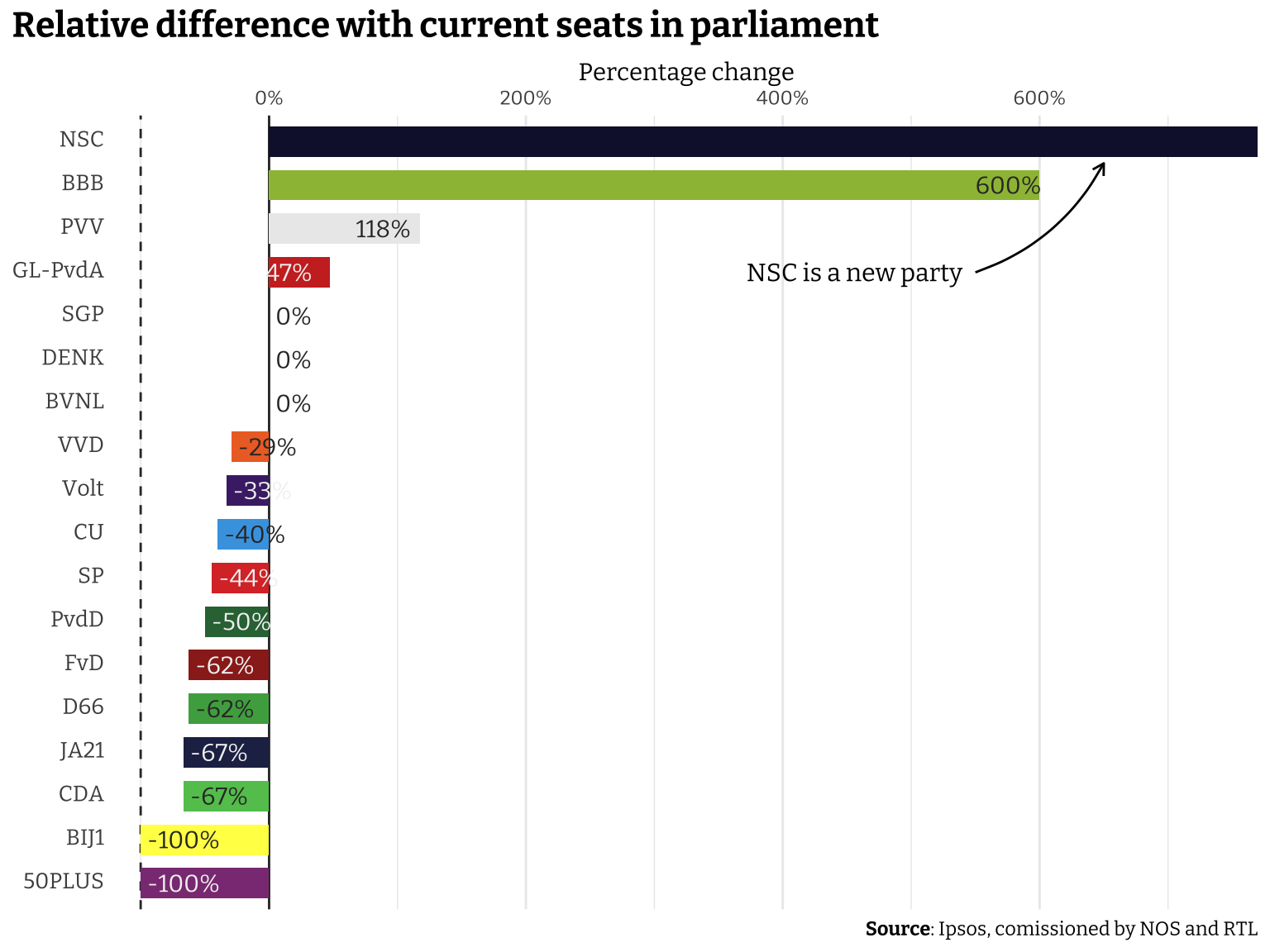
Since the NSC is a new party it’s increase (no matter how little or large it would have been) is infinite. Since the party got 20 seats, I think it looks fairly logical to have it appear at the top. If it was a much smaller party, I would have maybe forced it to be shown at the bottom to incidate that this is a statistical anomaly. The Boer Burger Beweging (BBB) has one seat in the current parliament after their first participation in the previous election, but will increase to 7 in the next parliament that will be seated early December. There are two parties that according to these numbers will be removed from parliament (indicated by the 100% decrease in seats in parliament). I would say that having the most important numbers be somewhat squished on the left of the plot is perhaps not ideal, but it’s a trade-off from showing the large increase in the NSC and BBB.
Next I wanted to look at the results per municipality to see if there were any trends I could identify. The Kiesraad publishes preliminary results per municipality also, but this data is quite a headache to scrape so I’ll use the website AlleCijfers.nl instead that more conveniently lists everything in an HTML table that we can scrape. See here for the Python code to scrape the website.
Show code
results_municipality <- read_delim("./data/election_results.csv", delim = ";") |>
  rename(region = Regionaam) |>
  mutate(
    across(everything(), ~ str_remove(.x, "%")),
    across(everything(), ~ str_replace(.x, ",", ".")),
    across(-region, parse_number)
  ) |>
  pivot_longer(cols = -region, names_to = "party", values_to = "perc") |>
  left_join(data_parties) |>
  mutate(
    region = str_remove(region, "Gemeente"),
    region = str_trim(region)
  )
To create the map, I downloaded a geopackage file from the Centraal Bureau voor de Statistiek (CBS) page on geographical areas where they share current and historical files on a number of divisions (provinces, municipalities, security regions, etc.). The geopackage format can be parsed with the {sf} package. The file contains several “layers” that can be listed through the sf::st_layers(<file>) functionality.
Show code
geo_municipality <- sf::st_read(
  "./data/cbsgebiedsindelingen2023.gpkg",
  layer = "gemeente_gegeneraliseerd",
  quiet = TRUE
) |>
  janitor::clean_names()
The thing I was most interested in at first is how progressive or conservative (I’ll refer to this as “political identity” from now on), and how left- and right-wing the municipalities are (“political color”). As noted before, the political color of the PVV is somewhat controversial, where KiesKompas would put in the centre-right due to it’s populist agenda, the party is usually mentioned among the far-right parties, both nationally and internationally. I could change the value for this part of the analyses, but I’m not comfortable setting another value, so look at the following plots with this caveat in mind. Considering the electoral victory the PVV won this election cycle, the plots should probabaly look more right-wing than the shown values represent.
weighted.mean() functionFor these plots I’ll calculate two measures, the weighted mean of the political identity and the weighted mean of the political color. I’ll use the percentages in each municipality as the weights and the values from KiesKompas to aggregate for each measure. It’s important to note that there were many more parties the electorate could vote for, but not all were given a political identity or color by KiesKompas, so data from these (usually very small) parties is ignored.
Show code for the plot
summary_municipality <- results_municipality |>
  group_by(region) |>
  summarise(
    mean_political_identity = weighted.mean(progcon, w = perc, na.rm = TRUE),
    mean_political_color = weighted.mean(leftright, w = perc, na.rm = TRUE)
  ) |>
  inner_join(geo_municipality, by = c("region" = "statnaam"))

(summary_municipality |>
  ggplot() +
  geom_sf(
    aes(geometry = geom, fill = mean_political_identity)
  ) +
  labs(
    title = "Political identity",
    subtitle = "Is the municipalitiy more<br>
      <span style='color: #B24334'>**progressive**</span> or
      <span style='color: #4180B4'>**conservative**</span>?",
    fill = NULL
  ) +
  scico::scale_fill_scico(
    palette = "vik",
    limits = c(-50, 50),
    guide = guide_colorbar(ticks = FALSE, barheight = 0.75, barwidth = 15, reverse = TRUE)
  )
) + (
  summary_municipality |>
    ggplot() +
    geom_sf(
      aes(geometry = geom, fill = mean_political_color)
    ) +
    labs(
      title = "Political color",
      subtitle = "Is the municipalitiy more<br>
        <span style='color: #B24334'>**left**</span> or
        <span style='color: #4180B4'>**right**</span> leaning?",
      fill = NULL
    ) +
    scico::scale_fill_scico(
      palette = "vik",
      direction = -1,
      limits = c(-50, 50),
      guide = guide_colorbar(ticks = FALSE, barheight = 0.75, barwidth = 15, reverse = FALSE)
    )
) +
  plot_layout(guides = "collect") +
  plot_annotation(
    caption = "Election results scraped from _AlleCijfers.nl_,<br>
      Political identity and color mapped from _KiesKompas_"
  ) &
  theme_void(base_family = "custom") &
  theme(
    plot.title.position = "plot",
    plot.title = element_markdown(size = 16, face = "bold"),
    plot.subtitle = element_markdown(),
    plot.caption = element_markdown(lineheight = 1),
    plot.caption.position = "plot",
    legend.text = element_blank(),
    legend.position = "bottom"
  )
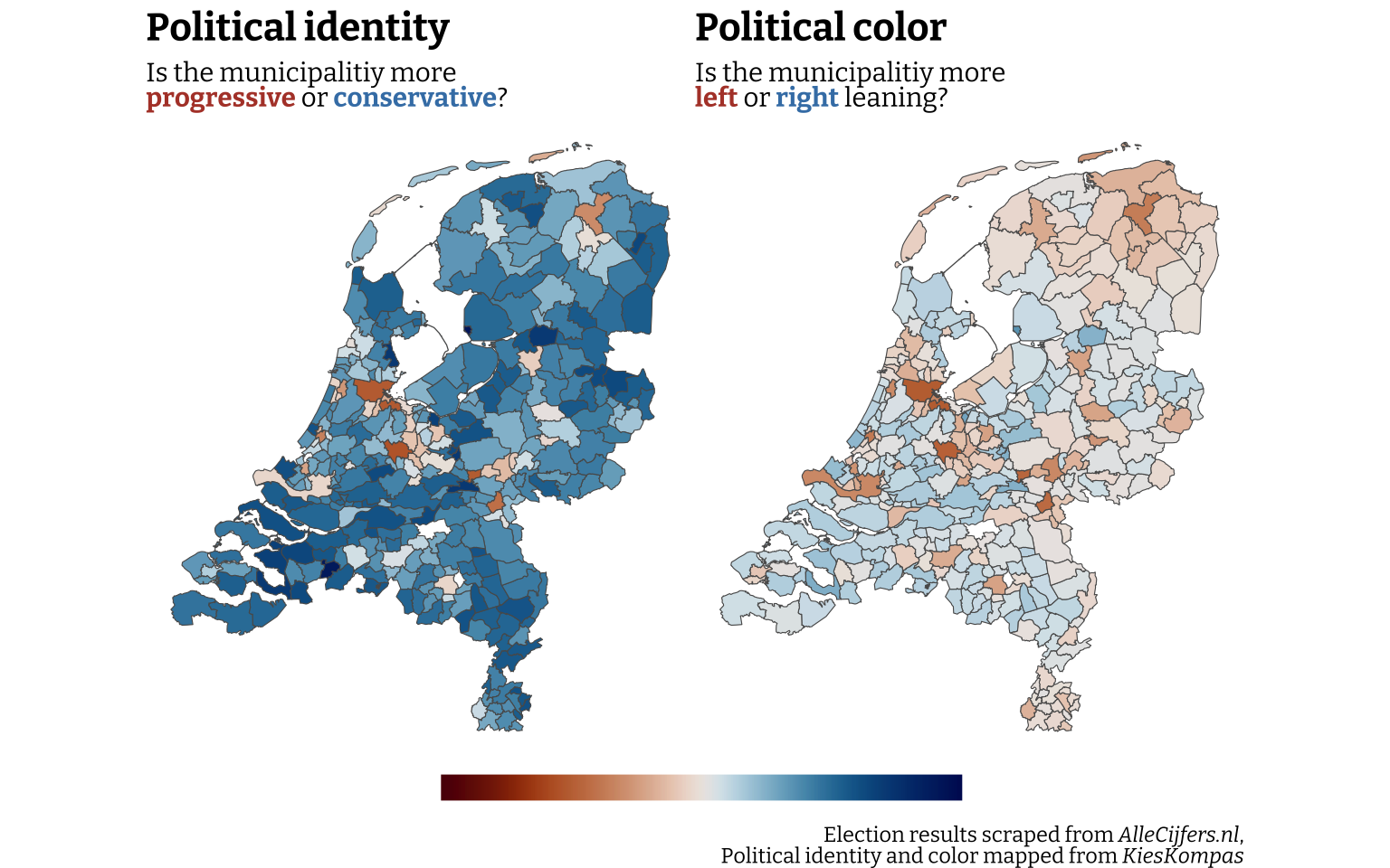
The first important thing to mention is that the geopackage file and the dataset with the election results have a slight mismatch. There is a difference of 5 municipalities. Should I use some time to find out which these 5 municipalities are? Probably. Do I have either time or motivation to do it right now? No, I don’t. I’m gonna assume it’s due to different spellings, outdated files on either side, or some merging or aggregation in either dataset prior to downloading it that may be the cause. Another caveat to keep in mind.
Anyone with some familiarity of Dutch geography might immediately notice the large red spots in some familiar areas. As usual, the big cities and the cities with a significant population of younger people and/or students are markedly more progressive and left-wing than the surrounding areas, in particular the municipality in the east and south and following the Biblebelt. This is not a surprise for me, or anyone, but nice to see confirmed. To address the issue of the political color of the PVV, I tested replacing the value for the political color with 50 (the same as the VVD), which is a big increase from 9 given by KiesKompas. In this experiment (which I intentionally don’t show here to stay true to the data reported), the two plots look very similar in color too in addition to trend already visible in the plot based on the data reported.
This was an interesting challenge to visualize data both accurately and responsibly. Despite the outcome of the election, it was fun to work with data as it came in. If I feel qualified to do so, I might repeat this post for the next elections for the Norwegian parliament in 2025 or the next Dutch election (whichever comes first). If you’re reading this far down, thanks for your interest, and hope it was interesting and perhaps of some use to you.