Learning data viz from the best: the Financial Times
16 April 2025
I’ve wandered around the data viz community for a while now, and it tends to be same set of news agencies, organisations, and individuals that are shared and discussed repeatedly for their ingenuity, creativity, or just excellent execution. Some of my sources of inspiration are (among others), Axios (with for example Will Chase), the New York Times, and the (now defunct) FiveThirtyEight. As for individuals, I’ve always looked up to Cédric Scherer for his ability to make data viz accessible for newcomers, he also runs the commmunity event 30DayChartChallenge which is an excellent source of inspiration from many data viz enthusiasts. And Nadieh Bremer for her incredible creativity and artistic data viz work, also for her book Data Sketches she wrote together with Shirley Wu, absolutely gorgeous data visualization that communicates a message very clearly. There’s also the Data Vizualization Society which aims to promote data viz practices and whose conference I still want to visit some day.
One person that I look up to and admire most of all is John Burn-Murdoch, chief data reporter at the Financial Times. He’s become the center of a lot of attention particularly due to his excellent data visualizations during the COVID-19 pandemic, creating informative and accessible graphs that were easy to understand for people without a data background, and he’s spend a lot of energy and effort explaining principles important to understand the rate of changes in the COVID cases (e.g. how logarithmic scales work and the effects of lockdowns visible in the data). You can find plots by his hand and by other data journalists on a dedicated page on the FT website (link).
The graphs and figures created by John Burn-Murdoch and his team are initially mostly done in R, mostly through {ggplot2} (and associated packages) as described in this slidedeck. John has mentioned that they use D3 and Leaflet as well to make production-ready figures using templating, but occasionally figures get pushed directly to print from ggplot.
Therefore, under the guise of “Imitation is the sincerest form of flattery that mediocrity can pay to greatness”, it seemed like a good exercise to try to recreate one his (currently) relevant plot in ggplot and see how close we can get to the result the FT included in their article and what we can learn about the FT’s choices along the way. I thought this might be a fun exercise in learning from the best and see if we can apply what we’ve learned to some other plots as well.
The reference figure
The figure we’ll try to recreate here is a figure from an article published online on the 11th of April 2025 (link). I’ve copied the illustration from a post from John on BlueSky below to serve as a reference point. It’s this plot we’ll first try to recreate.
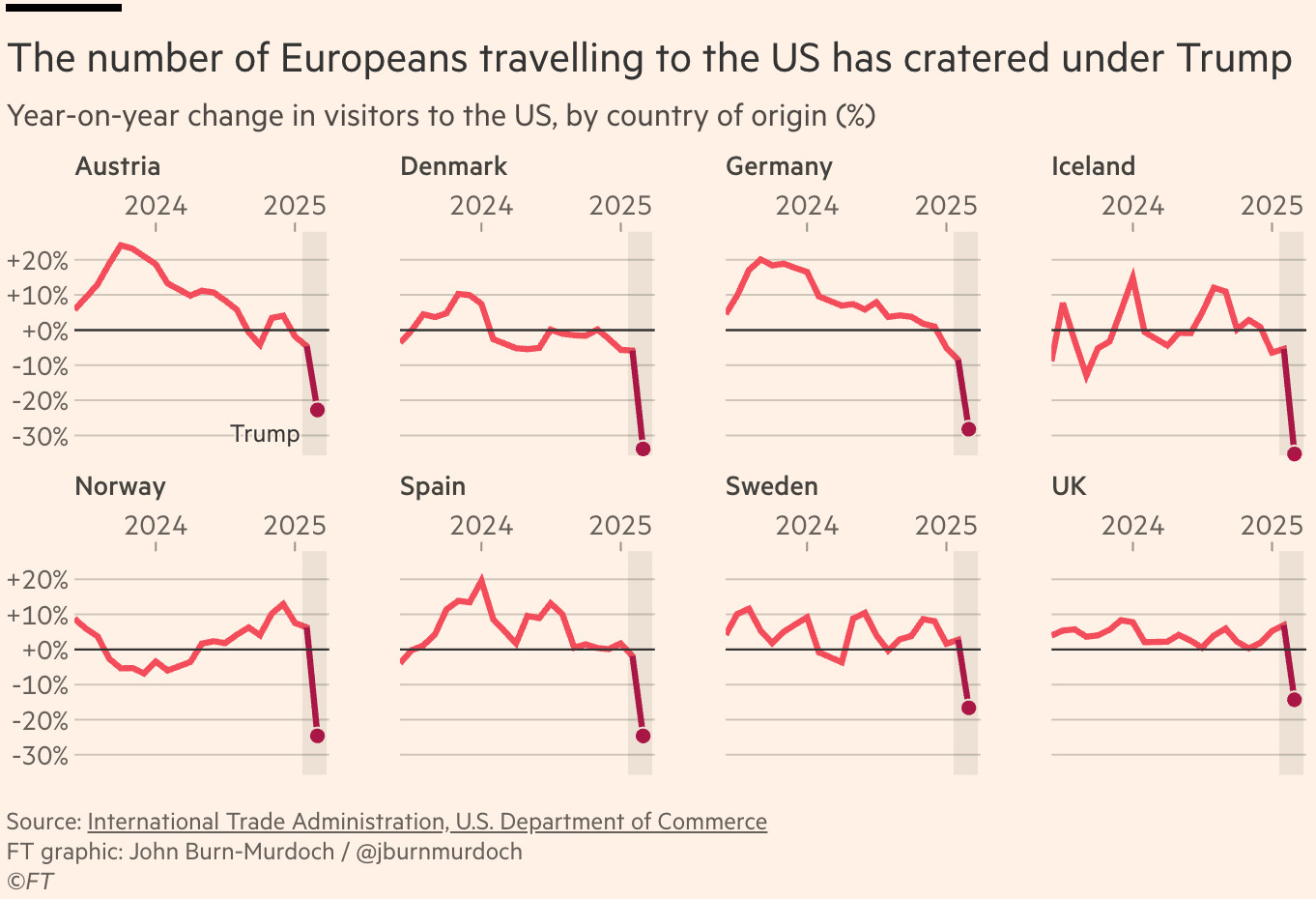
Let’s break it down first. It’s a simple line plot, with a highlight at the end in the form of a large point. The figure is faceted along a number of countries. The x-axis ticks show only two dates (2024 and 2025) and the y-axis ticks show a percentage. The percentage refers to the year-on-year change in visitors to the US as indicated in the subtitle of the plot. This change can be either positive or negative. The +-sign along the y-axis labels is technically redundant, but aids legibility There are no separate axes titles to avoid redundancy, it also removes the awkward rotated y-axis title that hurts legibility. The title of the plot does not directly describe the data or the figure, but rather focuses on the message of the figure. Only the major y-axis grid is visible, the lines along the x-axis are hidden to remove redundant ink. There is a shaded area in each facet that indicates the time Trump has been occipying the presidency again. This is indicated by an annotation in only the first of the eight subplots. The caption of the figure shows the source of the data, the creator, and the copyright ownership. In the original FT article, the links to the source of the data are clickable hyperlinks, hence the underline.
Recreating the FT figure
So let’s see if we can recreate this plot in R. For this we’ll load the {tidyverse} package for now, and we’ll use any other functionaltiy from other packages using the :: scope resolution syntax.
library(tidyverse)
The data visualized in the FT figure comes from the US International Trade Administration, and the data on international travelers is collected as part of the Arrival and Departure Information System (ADIS) I-94 program. The monthly data can be downloaded from the trade.gov website on that topic (link). It comes in an Excel format with both the numbers, and the monthly year-on-year change in separate sheets. The data in the plots seems to come from the second sheet, so we’ll load that one.
data <- readxl::read_xlsx(
  "data/Monthly Arrivals 2000 to Present – Country of Residence (COR)_1.xlsx",
  sheet = "Monthly Y-o-Y % Change",
  na = "- - -"
) |>
  janitor::clean_names()
As always, the column names in the Excel are hard to parse, so instead we’ll just manually replace all the column names. Then we can ensure the columns have right type and select the countries shown in the original figure.
pre_cols <- c("index", "country", "world region")
dates <- format(
  seq(as.Date("2000-01-01"), as.Date("2025-03-01"), by = "months"),
  format = "%Y-%m"
)
post_cols <- c("x1", "x2", "x3", "notes", "x4")
cols <- c(pre_cols, dates, post_cols)

names(data) <- cols

data_oi <- data |>
  mutate(
    across(all_of(dates), as.numeric)
  ) |>
  filter(
    country %in% c(
      "Austria", "Denmark", "Germany", "Iceland",
      "Norway", "Spain", "Sweden", "United Kingdom"
    )
  )
The data at this point is still in wide format, so we need to convert the dataset to long format (using pivot_longer()) and get the column in a nice date format. During my initial stages of experimenting with this figure I found that the year-on-year change in the raw data is a lot more volatile than shown in the FT graph. I think John used either splines or a sliding window function to smooth the data. I seem to recall a presentation he gave where he did mention splines, but for now I think we can just use the simpler sliding window function from the {slider} package. I’ll set a fairly conservative setting for now and will discuss why further below. The data also goes back to 2000, but the original figure only shows recent data, so we’ll only select data from June 2023 and onwards
data_long <- data_oi |>
  pivot_longer(
    cols = all_of(dates),
    names_to = "month",
    values_to = "perc_change"
  ) |>
  select(country, month, perc_change) |>
  group_by(country) |>
  mutate(
    month_dt = as.Date(str_glue("{month}-01")),
    perc_change_smooth = slider::slide_dbl(
      perc_change, mean,
      .before = 0, .after = 1
    ),
    country = replace(country, country == "United Kingdom", "UK")
  ) |>
  filter(
    month_dt >= as.Date("2023-06-01")
  )
The default typeface setting for ggplot’s built-in themes is "sans", which on most machines defaults to Arial, which is widely hated for its blandness and because of it’s overuse it took down the font it’s copied from, Helvetiva, with it. It’s fairly easy to change the font in ggplot using a single call to {sysfonts} and a single call to {showtext} as shown below. Here I’ll pick a font that is fairly close to the sans-serif typeface the FT uses. The FT uses Metric, which is a humanist sans-serif typeface, and Google Fonts has a typeface that is quite nice called Open Sans that we’ll use instead. We can specify that font in the font_add_google() function and alias it to "open-sans" so we can use it later in the ggplot function calls. The showtext_auto() function from {showtext} enables more graphics devices which allows for support for fonts from for example Google Fonts.
sysfonts::font_add_google(name = "Open Sans", family = "open-sans")
showtext::showtext_auto()
Okay, now comes the longest code block, so I’ll split it up in chunks to make it easier to follow. The elegance of the FT figure comes not from the creative use of geom’s, but by excellent layout of the plot, so we mimic that by just using a simple geom_line(), supplemented with a geom_point() that draws the highlight for the latest month. The dot seems to contain a circle around it, so we’ll use the background color of the shaded area as the outline of the dot and fill the color with color instead. A geom_rect() draws the dark shaded area to indicate Trump’s time in office. The order of the geom’s determines the order they are plotted, and since the line and point in the original plot appears darker for the latest months the shaded rectangle should be drawn on top of the red line and dot. For added information the FT used something line geom_hline() to more clearly indicate the difference between postive and negative. This line is also drawn on top of the lines and rectangles. The annotation for the rectangle is drawn only in the first facet (which shows Austria), so we’ll use a geom_text() there. Getting that one in the correct coordinates and size was a bit of trial-and-error, but then again, everything in data viz is trial-and-error.
ft_plot <- data_long |>
  ggplot(aes(x = month_dt, y = perc_change_smooth)) +
  geom_line(
    color = "#ED344A",
    linewidth = 1.2,
  ) +
  geom_point(
    data = data_long |>
      filter(month_dt == max(month_dt)),
    mapping = aes(y = perc_change),
    size = 3,
    shape = 21,
    fill = "#ED344A",
    color = "#E9D8CB"
  ) +
  geom_rect(
    aes(
      xmin = as.Date("2025-01-06"),
      xmax = as.Date("2025-04-01"),
      ymin = -Inf,
      ymax = Inf
    ),
    fill = "black",
    alpha = 0.005,
  ) +
  geom_hline(
    yintercept = 0,
    color = "#383635",
    linewidth = 0.75
  ) +
  geom_text(
    data = tibble(
      month_dt = as.Date("2024-12-28"),
      perc_change_smooth = -0.29,
      country = "Austria"
    ),
    aes(label = "Trump"),
    size = 4.5,
    family = "open-sans",
    hjust = 1,
  )
Then, since John used only two labels on the x-axis (which is drawn on top instead of below as is default) we’ll specify that in scale_x_date(). For the y-axis the original figure only has ticks going until “+20%”, while ggplot likes to draw “+30%” also unless specified, so we’ll change the breaks there manually, and the +-sign before the positive percentages is also non-default, so we’ll specify that through the style_positive argument in scales::label_percent().
ft_plot <- ft_plot +
  scale_x_date(
    position = "top",
    breaks = "year",
    date_labels = "%Y",
    expand = expansion(add = c(0, NA))
  ) +
  scale_y_continuous(
    breaks = seq(-0.5, 0.2, 0.1),
    labels = scales::label_percent(style_positive = "plus")
  )
One stand-out element of John’s figures (and a lot of good data viz) is that the title of the figure it not informative but descriptive. A commonly seen main title for a figure like this would be “Line plot showing year-on-year change in visitors”, which John also uses, but not as the main title, but instead as the subtitle. The main title describes the main message of the figure. Everyone will quickly see that the lines go down rather steeply in the shaded areas, but why not make it even clearer by adding that in the title. It helps guide the viewers to what they’re supposed to “get” from the figure, i.e. the message, and the details on what the plot shows can often be relegated to the subtitle. I realize that in academic settings this wouldn’t often fly, but in business settings and especially in data journalism, this is a really nice accessibility feature. An elaborate caption is also quite a nice place to place additional information. Again, in an academic setting this would usually go in a textbox below the figure in LaTeX or Word, but it’s nice to add this information in the figure directly from ggplot if suitable.
ft_plot <- ft_plot +
  labs(
    title = "The number of Europeans travelling to the US has cratered under Trump",
    subtitle = "Year-on-year change in visitors to the US, by country of origin (%)",
    x = NULL,
    y = NULL,
    caption = "Source: International Trade Administration, U.S. Department of Commerce
FT graphic: John Burn-Murdoch / @jburnmurdoch, adapted by Daniel Roelfs
©FT"
  )
Finally we’ll update the final bits. We’ll ensure that nothing is “cut-off” from the plot by the x- or y-axis limits so we’ll add coord_cartesian(clip = "off") part. Then we specify the faceting using facet_wrap(). The x-axis is the same for all facets, but in the original plot it is drawn for each subplot to aid legiblity, so we’ll add scales = "free_x" to ensure each subplot gets their own x-axis labels. We’ll also change a bunch of default settings in `theme_minimal() to make it resemble more closely the original plot from the FT, including background color, panel grid, text sizes, and spacing. The main title and facet headers seem to be some sort of semi-bold text inbetween regular and bold, which is not (directly) supported by ggplot, so we’ll stick to bold.
ft_plot <- ft_plot +
  coord_cartesian(clip = "off") +
  facet_wrap(~country, scales = "free_x", nrow = 2) +
  theme_minimal() +
  theme(
    text = element_text(family = "open-sans"),
    plot.title = element_text(
      size = 19,
      face = "bold",
      margin = margin(t = 1, b = 1, unit = "lines")
    ),
    plot.subtitle = element_text(
      size = 15,
      margin = margin(b = 1, unit = "lines")
    ),
    plot.title.position = "plot",
    plot.caption = element_text(
      size = 10,
      lineheight = 1.2,
      hjust = 0,
      margin = margin(t = 1.5, unit = "lines")
    ),
    plot.caption.position = "plot",
    panel.grid.major.x = element_blank(),
    panel.grid.minor.x = element_blank(),
    panel.grid.major.y = element_line(color = "#CABEB0"),
    panel.grid.minor.y = element_blank(),
    panel.spacing.x = unit(2, "lines"),
    strip.placement = "outside",
    strip.text = element_text(
      size = 12,
      face = "bold",
      hjust = 0
    ),
    axis.text = element_text(size = 12),
    axis.ticks.x = element_line(color = "#958B82"),
    plot.background = element_rect(
      fill = "#FFF1E5",
      color = "transparent"
    )
  )
The final result
Finally, let’s have a look at the final result and how closely our plot resembles the original.
print(ft_plot)

I’m rather satisfied with the result! We managed to get fairly close to the original. It’s a nice reminder of what is possible in ggplot if you’re able to spend some time tweaking the details. And to throw another cliché out: the devil is in the details.
Though we weren’t able to reproduce everything exactly. Even though the source of data is the same, the lines look a bit different. Our lines still look a bit more jagged than the original, so I’m guessing John used a different smoothing strategy (probably splines). I tried playing around a bit with the settings for the window functions, but either the drop at the end was smoothed too much, or the lines didn’t look identical. But then I noticed that the darker shade of the red line in the original plot is not due to the grey shaded rectangle, but a separate line segment. If you zoom in you’ll notice that the darker color doesn’t start at the shaded area, but that there’s an entirely separate segment altogether that runs either on top, or continues at the end of the lighter shade of red. So it’s also possible that they decided to smooth the historical data and keep the raw data for the latest data for maximum impact. The accuracy of the historical data is less important (I think very few people would care about whether it is +11% or +13% in February 2024). This is a nice data viz trick to draw attention to the message and the most important data which may be permissible in certain contexts, but will not fly in an academic setting or any other setting where point accuracy of the data is crucial. Again, I’m not sure this is what they did, perhaps they wanted the color to be darker and only used a different smoothing function and drew the latest segment twice to draw the darker segment on top. This seems to be supported also by the fact that in the zoomed in screenshot below the lighter segment doesn’t seem to terminate where the darker shade begins but instead continues down to follow the darker shade. Either way a really nice reminder how much thought and detail goes into good data viz.

All in all, I’m really happy with close we got the original plot. The original is a really nice and effectize data vizualization, and it’s cool to see how close we can get with basic ggplot commands supplemented with some smoothing functions and custom fonts. Let’s now apply this to some other data to see if we can replicate these practices to new data.
Applying this strategy to other figures
I spoke with a friend not too long about the results from the World Happiness Report and where Norway fell on the scale. This led us to an article from the Norwegian Institute of Public Health (Folkehelseinstituttet) with some figures we could try to improve upon with some of the techniques that the FT used.
Once again, the data source is quite clearly labeled in the article, it’s the data collected for the World Happiness Report. The data in the FHI article goes back to 2007, but the data I could find in the Excel file linked on the webpage mentioned only goes back to 2011 which I think is close enough. The FHI researchers used geom_smooth() it looks like, but we’ll apply the same sliding window function as before.
data_happiness <- readxl::read_xlsx(
  "data/Data+for+Figure+2.1+(2011–2024).xlsx"
) |>
  janitor::clean_names() |>
  group_by(country_name) |>
  mutate(
    ladder_score_smooth = slider::slide_dbl(
      ladder_score, mean,
      .before = 0, .after = 1
    )
  )
Then we can create a similar plot to earlier, we’ll pick the same set of countries that were highlighted in the FHI article to include in each of the facets. Apart from the pandemic perhaps, there’s no singular big event that could be shaded. Since the yellow-ish background color seems to be a trademark of the FHI, we’ll stick with a white background for this plot, even though it clashes with the rest of the background in this article. Since this code chunk is much of the same as before and rather long, I left this code folded by default.
Code for the plot
coi <- c(
  "Norway", "Sweden", "Denmark", "Finland", "Iceland",
  "United States", "Mexico", "Costa Rica"
)

data_happiness |>
  filter(
    country_name %in% coi
  ) |>
  ggplot(aes(x = year, y = ladder_score_smooth)) +
  geom_line(
    color = "#2C2C4E",
    linewidth = 1.5,
    show.legend = FALSE
  ) +
  geom_point(
    data = data_happiness |>
      filter(country_name %in% coi, year == max(year)),
    size = 4,
    shape = 21,
    fill = "#2C2C4E",
    color = "white"
  ) +
  scale_x_continuous(
    breaks = c(2012, 2018, 2024),
    position = "top",
    expand = expansion(add = c(0, NA))
  ) +
  scale_y_continuous(
    limits = c(6, 8.25)
  ) +
  labs(
    title = "Norwegians have become less satisfied with their lives the past years",
    subtitle = "Life evaluations on a scale from 0 to 10",
    x = NULL,
    y = NULL,
    caption = "Source: World Happiness Report\nData collected by Gallup\nGraphic by Daniel Roelfs"
  ) +
  coord_cartesian(clip = "off") +
  facet_wrap(~country_name, scales = "free_x", nrow = 2) +
  theme_minimal() +
  theme(
    legend.position = "none",
    text = element_text(family = "open-sans"),
    plot.title = element_text(
      size = 18,
      face = "bold",
      margin = margin(t = 1, b = 1, unit = "lines")
    ),
    plot.subtitle = element_text(
      size = 14,
      margin = margin(b = 1, unit = "lines")
    ),
    plot.title.position = "plot",
    plot.caption = element_text(
      size = 10,
      lineheight = 1.2,
      hjust = 0,
      margin = margin(t = 1.5, unit = "lines")
    ),
    plot.caption.position = "plot",
    panel.grid.major.x = element_blank(),
    panel.grid.minor.x = element_blank(),
    panel.grid.major.y = element_line(color = "#dddddd"),
    panel.grid.minor.y = element_blank(),
    panel.spacing.x = unit(2, "lines"),
    strip.placement = "outside",
    strip.text = element_text(
      size = 12,
      face = "bold",
      hjust = 0
    ),
    axis.text = element_text(size = 12),
    axis.ticks.x = element_line(color = "#888888"),
    plot.margin = margin(
      t = 1, r = 7, b = 1, l = 1, unit = "lines"
    ),
    plot.background = element_rect(
      fill = "white",
      color = "transparent"
    )
  )

It doesn’t really have a the same impact as the FT plot though I do think it’s an improvement on the original figures in the FHI article. Which just really goes to show that in good data viz one should always keep an open mind and not blindly rely on repeating the same trick. But again, a minor improvement is a lot better than no improvement and while not every figure can have the impact of an FT plot designed by the biggest experts in the data viz who have a team of data journalists working together, extending a simple ggplot call can go a long way to make a figure better at a relatively investment of time and effort.
Let’s try to recreate another figure from the FHI article comparing a number of customers in a single figure instead. Here we won’t facet the plot, but instead we’ll label the countries of interest by color. Since the countries specified above were all similar countries, it would be more interesting to label more varied countries (also to avoid that all the labels are smushed at the top end of the figure). To get some nice figures (other than the boring default ones), I’ll use the palette generator function tableau_color_pal() from {ggthemes} to get a set of visually distinct colors for the countries of interest. All other countries will get black. And since Norway is the main focus in this figure, we’ll reorder the factor levels such that Norway is drawn on top of the other lines. We’ll also lower the opacity for the countries not of interest.
tableau_color_pal() is a higher order function, hence the “double” set of parenthesescoi <- c(
"Norway", "Sweden", "United States", "Mexico", "Afghanistan",
"China", "South Africa", "Ghana"
)
country_color_pal <- ggthemes::tableau_color_pal()(n = length(coi))
data_country_plot <- data_happiness |>
left_join(
tibble(country_name = coi, country_color = country_color_pal),
by = "country_name"
) |>
replace_na(list("country_color" = "black")) |>
mutate(
opacity = ifelse(country_name %in% coi, 1, 0.05),
country_color = fct_relevel(
as_factor(country_color), country_color_pal[0],
after = 0
)
)
Then we can create the plot with (roughly) the same parameters as before. To ensure that the labels don’t overlap, we’ll use geom_text_repel() from {ggtext} instead of geom_text() and limit the floating to the right side of the plot. Again, the code is folded by default.
Code for the plot
data_country_plot |>
  ggplot(aes(
    x = year,
    y = ladder_score,
    color = country_color,
    fill = country_color,
    alpha = opacity,
    group = country_name
  )) +
  geom_line(
    linewidth = 1.2,
    show.legend = FALSE
  ) +
  ggrepel::geom_text_repel(
    data = data_country_plot |>
      filter(
        country_name %in% coi, year == max(year)
      ),
    aes(label = country_name),
    size = 4,
    fontface = "bold",
    xlim = 2024.1,
    hjust = 0,
    force = 10,
    min.segment.length = 1,
    seed = 42,
  ) +
  geom_point(
    data = data_country_plot |>
      filter(
        country_name %in% coi, year == max(year)
      ),
    mapping = aes(y = ladder_score),
    size = 4,
    shape = 21,
    color = "white"
  ) +
  scale_x_continuous(
    breaks = c(2012, 2018, 2024),
    position = "top",
    expand = expansion(add = c(0, NA))
  ) +
  scale_y_continuous(
    limits = c(1, 8)
  ) +
  scale_fill_identity() +
  scale_color_identity() +
  scale_alpha_identity() +
  labs(
    title = "Norwegians have become less satisfied with their lives the past years",
    subtitle = "Life evaluations on a scale from 0 to 10",
    x = NULL,
    y = NULL,
    caption = "Source: World Happiness Report\nData collected by Gallup\nGraphic by Daniel Roelfs"
  ) +
  coord_cartesian(clip = "off") +
  theme_minimal() +
  theme(
    legend.position = "none",
    text = element_text(family = "open-sans"),
    plot.title = element_text(
      size = 18,
      face = "bold",
      margin = margin(b = 1, unit = "lines")
    ),
    plot.subtitle = element_text(
      size = 14,
      margin = margin(b = 1, unit = "lines")
    ),
    plot.title.position = "plot",
    plot.caption = element_text(
      size = 10,
      lineheight = 1.2,
      hjust = 0,
      margin = margin(t = -2, unit = "lines"),
    ),
    plot.caption.position = "plot",
    panel.grid.major.x = element_blank(),
    panel.grid.minor.x = element_blank(),
    panel.grid.major.y = element_line(color = "#555555"),
    panel.grid.minor.y = element_blank(),
    panel.spacing.x = unit(2, "lines"),
    axis.text = element_text(size = 12),
    axis.ticks.x = element_line(color = "#888888"),
    plot.margin = margin(
      t = 1, r = 7, b = 1, l = 1, unit = "lines"
    ),
    plot.background = element_rect(
      fill = "white",
      color = "transparent"
    )
  )

This seems to be a lot more effective. Once again, tailor your graph to the data and the message you’re trying to show. You don’t need to show everything in every plot, and showing too much info can drown out your message. Either way, this was a fun exercise to see how close one can get to figures created one of the data viz experts I admire most. I hope it may inspire you also to be bold and move beyond the default parameters on your figures made in ggplot or elsewhere. Everyone likes looking at beautiful figures more than at ugly ones, and people will remember the take-away from your data more if the same data is wrapped in a format that helps the viewer understand the message. I hope this has been informative and perhaps inspiring. I often look at visualizations made by people I admire (see the first paragraph this post) and try to take inspiration from there in projects I work on myself. Obviously don’t use trademarked characteristics in your personal projects, one doesn’t want to imply that a figure is made by the Financial Times or the New York Times if it isn’t, but be creative and incorporate elements from figures that work well and try to deduce what makes these visualizations work so well. Learning data visualization is a continuous and endless process but it’s a fun ride!